At start of this unit I produced 2 retrospective works, one showing my daughter as she perhaps saw herself using images from her phone and the second, showing my viewpoint of the same period of time.
My plan as I progressed with my research was to produce further test pieces. This post explores two further works. I have decided that, if I number my initial retrospective works as numbers 1 and 2, these latest test pieces are numbers 3 and 4.
The graveyard I used for test pieces 3 and 4 is in my local town and is no longer used, by which I mean no new burials use this space. The church is ruined and has no roof, the gravestones are worn, broken or tumbled over. Interestingly, some years ago, a road was widened which meant that old graves near the road had to be dug up and moved and reburied. This idea of reburying the past in an idea I thought about in my two works.
Test piece 3
This work explores the idea of fragmentation and how a photograph can only ever show a tiny slice of a whole person. My work showing all the images on my daughter’s phone explored this same idea but in this test work I have distilled down the visual element based around a broken gravestone. How much can ever be known about a person, whether through visual imagery, video recordings or the written word and how much can ever be shown or discovered through a simple memorial?

Richard Dalgleish, 2022, Haptic test piece 3
This test piece uses a photograph of a broken stone in a graveyard which has been re-assembled to form a kind of jigsaw of that person’s memorial. I printed image and then cut out a fresh “grave” which I filled with a deep black from the rear of a instamatic style print. Into the new grave, I sliced up small parts of Rebecca’s portrait. This mimics the randomness of the re-assembled grave marker. To my grave cut I have added some images of daisies from the ‘grave’ I just cut in the photograph. The daisy symbolises innocence where in an ancient Celtic legend, on the death of a child the gods sprinkled daisies over the earth supposedly to ease the pain of the bereaved parents.
I could have constructed this work on the computer but wanted to explore the haptic side of the image which I explored when looking at work of Geoffrey Batchen and Elizabeth Edwards. I cannot go into the graveyard and start digging holes so this haptic work using the physical nature of the photograph and cutting into these was an interesting way to look at this work. As I cutting that fresh “grave” in the photograph I thought of the gravedigger cutting into the earth. Overall am happy with this work although I wonder on reflection how my image might have worked differently if, instead of a cut out grave being an actual cutting of a hole in the photograph of the graveyard, I had made this more of a 3-dimensional space beneath the surface of the photograph. Almost a small black box within the graveyard.
Test piece 4
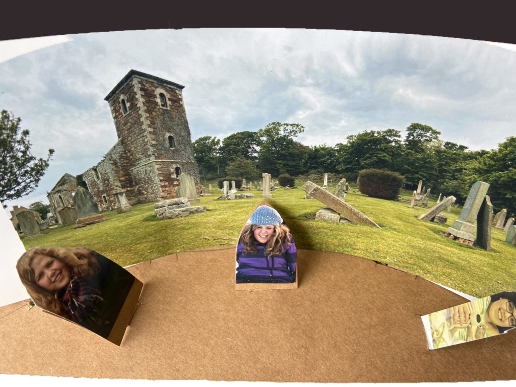
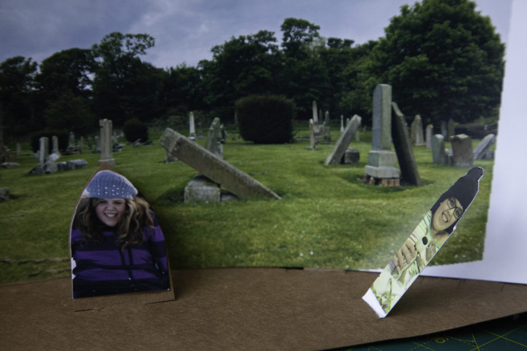
This test piece uses a related idea this time using the graveyard as a kind of stage. I wanted to explore the idea of the two-dimensional nature of photographs and by inference the two-dimensional/fragments of a life shown against the background of a graveyard. In this work I used my two-dimensional photographs to create a three-dimensional diorama.
For this work I took a series of images of a graveyard which I then assembled to form a panoramic image. I joined images on the computer with a view to having a curved image as my end result. I printed the panorama and glued tabs to the back. I then cut slots in some card and assembled image so it was like a curved cinema screen. I then took some prints of Rebecca and glued these onto card cut in shape of a headstone. I made Rebecca herself into a literal headstone. I stood the Rebecca headstones upright and cut slots for these in foreground of the model. I reviewed the look of this and then bent over the Rebecca gravestones to match in with tumbled down stones in rest of graveyard.

Richard Dalgleish, 2022, Haptic test piece 4

Richard Dalgleish, 2022, Haptic test piece 4
My review of this work is mixed. The idea has merit but am less sure about my execution of this idea. The use of plain card as the base of the model gives a strange look to foreground and seems to move the Rebecca graves from being part of the graveyard. Maybe if I had used a photograph of grass as the base this might have made the work more cohesive. I am unsure about the 3 pictures of Rebecca and whether the shock of a single image might have had a greater impact. My biggest concern is about the feel of the piece and whether images of Rebecca smiling on a grave marker introduces a strange feeling that might be out of balance with how graveyards normally thought of. Does this juxtaposition work or does the tension caused by use of a smiling image challenge why graveyards should be thought of as sombre places?