Add a short note to your learning log with one or two points that may have relevance to your own practice and project development.
Like last month’s case study, I don’t know Sarah-Jane Field and hadn’t come across her work during my studies. I was surprised by the direction of Field’s project using Artificial Intelligence as a partner in her collaboration and the complexity of this work, using proprietary machine-learning app, an artist character and music. I found her work very challenging although having said this the presentation on the OCA Padlet showing the development of this work, the steps and stages Field went through as she traverses the level 3 units and the final realisation of her work are all fascinating. For me this is kind of project which blows my mind and I wonder how my own efforts could ever measure up to this work?
Add a short note to your learning log with one or two points that may have relevance to your own practice and project development.
It is always interesting and instructive to see the work of others especially when these people have undergone their journey in same learning institution as I have. It fascinating to pick up the points of similarity and of difference. Jane Weinmann is great example. While I don’t know her and hadn’t come across her work during my studies, her work as presented on the OCA Padlet is very instructive. I was immediately struck by the layout and clear delineation of what Weinmann pulled together for her major project. Based on this case study, I have thought about areas of my own work which need further input, whether I haven’t thought of things yet or whether I have worked on these but haven’t produced anything yet in my blog. On a presentation point of view, I wonder if the Padlet provides a different way of presenting work from my blog which might be more accessible for assessors.
I watched Weinmann’s video production which explained her project and the research which underpinned her work. This was a very engaging, powerful and concise production and is worth consideration as a way to frame and explain my own work. The video can be seen on Vimeo.
Thinking positively about ourselves and our creative practice may need to factor in notions of self care. Self care is a personal approach to maintaining an emotional, physical and spiritual equilibrium, whatever our current context is and may include:
Taking care of physical health, mental and emotional wellbeing – ensuring time to rest.
Having a good balance with work and personal life
Looking after your own health
Protecting one’s own well-being and happiness, especially during periods of stress.
The stress of working on my chosen project is a constant factor, bringing memories which surround loss into the light. However, the stress of traumatic grief was greater still. The time I experienced that trauma impacted me in so many ways, both physical and mental so I can perhaps think of my study as they end of a long road travelled evenb though beyond my time with the OCA my study and interest in things related to loss continue. I believe that my project looking at loss and with my major project trying to find a way to engage with others provides a positive slant on mental health of working in this area which can, at times, feel claustrophobic and oppresive. I am someone who can be filled with doubts and worry about audience, tutors and those who assess my work. I mention this as was pleased to receive some very positive feedback on 3.2. All of these small victories help bring a sense that what I am doing is worthwhile. At the same time such feedback indicates that there is much still to learn.
In past few months, I have suffered a slipped disk which meant that nerves all the way down the side of face and my arm were in pain for much of the day and night. It took a while but this problem fixed itself with reassurance of MRI scan and then followup physiotherapy. I am now able to look straight ahead again when on Zoom calls and sitting at computer is much easier. I am acutely aware, both through experience and through my learning, that stress can cause physical symptoms so mental and physical health don’t always have a different root cause. I suppose my approach to fitting my studies around physical and mental health is to try and condense my work efforts so I limit time spent at computer. This means I sometimes produce a glut of written work at one go. Have had some kind of chest infection past couple of months maybe due to some post-Covid outcome so that has limited my exercise but I try and eat better, meet friends, laugh and joke.
In my planning for this project and for future works in a similar field, I need to set time aside for self-care. This can be seen as a risk to the completion of a project which is mitigated through time and patience and the awareness that my work can open old wounds.
What can I say more than this? Managing well-being and happiness, especially during periods of stress.punctauted by anniversaries which bring back memories of loss are a part of me now. I suppose I do (or try to do) the things above without thinking.
Take risks. Having a sense of curiosity and a willingness to experiment helps creative practitioners uncover ‘happy accidents’ and serendipitous outcomes. It can be tempting to stay safe if feeling the pressure of a major project. Allow yourself space to have fun, play, experiment and challenge yourself to take risks (whatever this means for you) to ensure you continue evolving your ways of working.
I have tended to swing one of two ways with risk taking; either I focus on expanding what I know or I keep trying new things while never drilling down to fully explore amy one idea to its full potential. I have been experimenting with glitches and the accidental image which relates to death for most of us. Outwith our control. Here example of some tests where I was looking at the liminal gateway itself and wondering what this might look like. I show these images as this idea relates to a bigger risk.
The bigger creative risk which I have been thinking of uses a see-saw. My exhibition would become a series of images displayed around a central sculptural piece. That central piece would be a see-saw which I make from a scaffold board. These are readily available up to 4.0m in length. The reason for see-saw is to represent the balance between life and death and at the fulcrum, the threshold of life. It is an object we associate with children so fits with root of my project and, as long as I get the balance finely tuned, this becomes a moving object at heart of my display. On each end of plank I am thinking if fitting a basket into which I would encourage my audience to write on small slips of paper and to place into the baskets on either end. These messages could be as simple as a name or whatever the audience member wants.
Technically there is no problem with making the see-saw. But what then? Do I decorate one end with images about death and memory such as the gravestone I show below which I photographed on a recent trip up north?
Could I create a slide to use for a cyanotype for this to transfer the image onto the board? I have a huge number of doubts about how this might look and feel. Do I look for a grafitti artist to decorate one half of board for me using the symbolism of death and thoughts of memory? And what then of other end of board? Do I leave it blank? Finally what of the threshold itself? A huge number of doubts and questions for one, one of biggest is does such a piece ask questions of the audience or is it obvious?
I presented work this month on Saturday 27th April, using a collection of found images from albums to which I had added my own thoughts with minimal edits. I asked peers to look at my blog post of images and words before the critique session then opened up a share of my screen during Zoom call and briefly introduced my creative works as a prompt to the discussion.
My creative works and my description of these works can be found on blog post below but for clarity, I will also show each image as I reflect on the feedback.
Some very interesting comments on the technical side of this image.The group discussed the baby and the mother, whether indeed this the mother or a stand in which might explain why head been removed. It wouldn’t explain why edge of image been faded in the way it has. One very interesting suggestion was that I shouldn’t look for elaborate reasons around the mother but that loss at edge of image might have a technical explanation. Is poor quality printing to blame? Maybe too much bleach been used. The group found this to be a very moving image.
The work above comes from some photographs from 1930s Germany. Again this attracted some technical comment over whether space between trees too dark and uniform. I have darkened this in Photoshop but maybe too much. Maybe the dark space needs some kind of focal point or gateway? There was interesting comment of the children wearing dark clothes and if they to take a few steps towards forest would be camoflaged and lost to view. The line between the light and the dark is the liminal boundary.. The boy’s foot behind the tree hints that he has just peeked from behind the tree trunk which both children with hands on the trunk seem to imply some kind of joining with the woods. To me it speaks of Hansel and Gretel and children abandoned in the woods. On another level, I wonder what became of these children with war coming. The liminal nature in this image works on different levels. How much of this might I present to audience though?
This work shows photograph album, focussed on an image of two women. There was discussion on whether the women content and happy or in darker mood mirroring their clothes. Maybe image a typical pose shaped for the camera pointed their way. The other images I presented in this set gave my audience more of a sense of vulnerability was one comment. I think I agree. This experimental work was perhaps weakest of those on show.
This photograph of Baby Andrew is one I have worked on before but here I decided to show the image in its cardboard mount with Santa on the cover. I felt that this asked lots of questions. Why is card so dirty? Is it because the card and photograph have been treasured possessions, handled often? To me this raises question of why Andrew has stayed as a baby and picture not set aside as Andrew grows. Where is picture of Andrew’s first day of school or his wedding or on holday and so on? These are questions I ask and stories I invent when picture has no obvvious story of its own beyond the briefest facts. One of peers commented on quality of the print and wondered about the folds in card and whether this had been placed on mantlepiece which is maybe why some parts are dirtier than others. Again it raises question of why this such a treasured picture. Another wondered if Santa dressed in red might date the print as this used as Coca-cola advertising. I did some quick research on this and it seems that Coca-cola used a red suit for Santa in the 1930s but that earlier images on Santa wearing red go back to the mid 19th Century. It appears, from a very brief look, that the Coca-cola/red Santa angle is an urban myth.
My next two images I photographed against a green background. I was susprised that my choice of background generated a lot of comment. That the green had meaning for my peers and that the texture of the cloth worked well. We discussed the emotional response to colour and how this would have looked with say a red or blue background. Green is supposed to represent hope, growth and renewal but also as the green darkens, of isolation and sickness or stagnation. This image to me was as much about the missing part of photograph as it is about the boy. Again I was surprised that the tear in the photograph generated lots of comment. I saw that tear at the liminal boundary. Others commented in how deliberate the tear looked. Had scissors been used? What was being carefully removed from view? One of my peers saw a witches face in the tear which is a fascinating insight and not something I had seen before. Also now that it been pointed out, it something we can’t unsee.
My final piece for review is photograph if very small locket. Each half of locket is only 3cm x 2cm. There was comment on apprent layering of the woman, the child’s face and a lighter patch above the child’s head which I cannot make out. A suggestion made then when faced with memorial, any choice made might be rejected and then subject to edit. So what is seen might not be as first intended. The word used for the locket was disquieting.
As part of discussion, I asked group opinions on sizing and scale. For each image I have shown the original size of print and of the locket. Do I show these as a group at real size, maybe with magnifying glass or do I present digital enlargment either on screen or as a print, or maybe I provide both, side by side? The locket above was one which my peers felt the original locket should be shown, perhaps in a case supported by an enlarged photograph. I wondered about putting images into a digital exhibition to try this and see how different scales work. One suggestion was to go large especially the stringing image of the dead child. How would such an image look if it filled a wall?.
As I answered questions on my work and give more details or explain the reasons behind each piece, my peer’s engagement with my work seems to grow. This is the age old quandry of how much description is needed alongside a visual work. An exhibition supported by a book and the detail of ensuring any book has ISBN number so that a trace of this survives. An interesting thought regarding memory. If thinking of books, I should speak to Helen Rosemier.
At a point where I had just received my 3.2 feedback and so my mind still thinking of that feedback, this was very helpful critique session. It was a small group, just the 4 of us and we only had 3 sets of work to look at, so we had time to look at work and talk it over without feeling rushed. I have some things to think about; scale, books or exhibition or both, presenting images on a monitor or as prints on a wall, looking again at my image of Max and Kathe.
One final comment. As I was presenting and answering questions and taking notes on comments made, I made a realisation. It was no longer important to me that people liked or were un-offended or not upset by my work. This is not to say I didn’t value feedback and opinion good or bad but just that getting a gold star and smiley face for my work isn’t what it is about for me nor why I make it. Maybe this is about a growing confidence in my area of expertise?
Last month I was working with test pieces which explored a single image of a boy and a cat. I investigated uncontrolled glitch art and then moved my efforts using manual computer edits as I wanted to exercise more control. I then considered the scale and presentation of these pieces. As I was working, I wondered about presenting photographs from my growing collection of old album images. Could I present these as part of my project either unchanged or perhaps with minimal alterations to suit my project idea? How would such works sit? Should I arrange a collection or present a single image? What of scale, enlarged or at the real size of the original image?
Below, I will show a selection of these old album photographs, although immediately, I have to point out that what I show are my photographs of the original images, so they are not the same as the originals. The most obvious aspect of this is in terms of size, so I have included details on the dimensions below each image. Along with the works, I will present a description of what these pictures say to me. These photographs are unique and have a special feel. If I destroyed such a photograph, there would be no replacement and, other than through my copies, that person would vanish from sight. These photographs speak to me of loss in different ways: loss of these people’s names, their connection with place or family, the interruption of familial memory and of these people’s place with the story of their lives. These photographs, to my mind, express the very crux of the liminality of death as viewed through photography.
I also have some objects associated with death, some brooches, a locket with a tiny photograph and a lock of hair. I have photographed these and, like the album images I mention above, I present these in a very simple form free of the often severe adjustments to contrast which I often use.
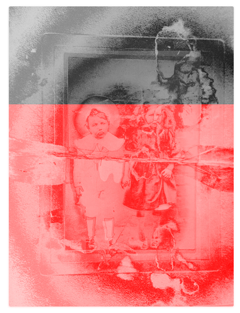
The photograph above was taken by Smallcombe of Baker Street in London. It shows a baby upon what I assume to be the mother’s knee. The baby is quite sharp and has its eyes open, so I assume that the child is dead. The baby is photographed in a long white gown, perhaps a christening gown. The mother’s head is not part of the picture. When I first saw this image, it looked to me like the folds and drapes of the mother’s dress and the child’s gown were fabrics in the interior of a coffin. The mother’s dress as the sides and the child’s robe stretches to fill the floor of the coffin. The photograph has a haunting quality. I wonder what the photographer thought as he took this image. Why is the mother’s head missing, and why is the image presented with the edge of the mother and the background fading away to nothing? I assume that this was intentional and not due to fading or ageing. I have left some slight mould near where the mother’s head would have been, almost as a nod to her presence. The child seems to be fully in the liminal threshold already distant from the mother. Slipping from sight. It is an image which speaks to me of the view from a different perspective where things linked with life are fading.
This photograph shows a boy and a girl leaning against a tree with other tree trunks in the background and a darker space leading deeper into the woods. The photograph has a bold 1cm border with a scalloped edge. On the back of the print, someone has written, “fur Max + Kathe”. This photograph was in a series I bought from Germany. Other photographs in this group were dated from the 1930s. I have darkened all of the areas behind the children. As if the children as going deeper into the woods or have come out to look at us one last time. The children place one hand each on the tree trunk as if in communion with the trees. I did some work with fellow student Caroline Black, where this commune with the trees was part of our shared work. I imagined the boy and girl as Hansel and Gretel, which is a fascinating and dark tale thought to be based on the fact that because of starvation, people abandoned their children in the forests. This piece further explores the ideas we played with in our shared work.
The image above shows a photograph of 2 old ladies set in an album which uses brown paper. I show size above for the photograph of the ladies although my image showing half of the photograph before and after is bigger. The women in this image are dressed in long, dark dresses and hats. The image itself is dark, and I wondered if there was an element of mourning wear about their dress. One of the women smiles for the photographer while the smaller and older woman looks stern. The photograph seems to be the last in the roll of film, and a bold line cuts off the right-hand side of the photograph with 2942 written on film. This bold line made me think of the liminal boundary. The photograph of 2 unknown people who are now dead and forgotten and have moved beyond that white line. In the liminal sense related to death, who might have written that number, and what might it mean? I wondered if it might be a ticket number to cross the River Styx. I have photographed the album deliberately cutting off the picture before and after the 2 ladies. I wanted this to appear to be like a production line.
I have used this photograph before, but I wanted to show it in context. The photograph of the child is presented in a folded card with Santa on the front cover. Opening the card, I find a handwritten message, “To Aunty Jean and Uncle Cecil with all my love. From Baby Andrew“. Folded that card measures 15 x 10cm and unfolded 15 x 22.5cm. The photograph and card are very dirty and marked. I can remove the photograph and see a cleaner colour both on the card and in the corners of the photograph. There is no date or other mark on the back of the photograph, so we are left to wonder about Aunty Jean and Uncle Cecil, who appeared to keep this card for a long time for it to attract so much dirt. Was the picture well handled, perhaps by cousins, or did Jean and Cecil have no children? What became of Baby Andrew that this picture of him as a child survived? Did he get sick or die and so the image became very precious? This is what many do when presented with photographs with a limited story. We invent things to fill the gaps, perhaps built from our own experiences.
This picture is all about the tear for me. Who or what was in the other half of the photograph? Why was the photograph torn, and why so roughly? There is a partial message on the reverse, which makes little sense as it is incomplete, but I decided not to include the message as the simple fact of the tear without words was enough for me. The boy looks towards the unknown. Unknown for us, not for him. Is he looking out of the window, or is there a figure there in that gap? Yet if a figure, there is no sense of contact between the boy and the other. The boy is isolated, torn apart from something which hovers just out of sight. The tear is a liminal boundary.
I bought this locket in an online auction. I think it is from the Victorian era, so it is over 100 years old. The case is in some kind of metal and is patterned front and back. Inside is what looks at first glance like a torn photograph of a young woman from the shoulder up wearing a wide-brimmed hat. On closer inspection, a small pale image of a baby has been placed next to the woman. The ephemeral nature of this pale image of the child speaks to me of the fragility of a young life around which no stories exist and few memories are created. My picture shows the locket open, and on the other side of the photo of the woman is a lock of blonde hair. The woman in the photograph has dark hair, so is the lock of hair from the child? I wonder about this locket. It is very fine with a loop for a chain to be worn around the neck. Was the woman and child memorialised for her husband or maybe a sister or her mother? It makes me wonder what happened. Did the child and mother die in childbirth? What stories can I build, and how can I fill in the blanks from such an object shorn from its home and family?
It was a change for me to produce these works where I have consciously tried not to put in too much. I try to keep the unspoken story in each image fresh and without making anything too obvious. The words above are my own sense of meaning, but I imagine others will have their own take. I will seek peer feedback on these works and will also look at framing and how these images would look if grouped together. I might create a small digital exhibition to gain insight into how such works might look and feel.
To expand on the feedback from my peers working on the 3.3 unit I also asked for feedback from a wider cohort of level 3 students at a critique session. Comments from that session are shown at the following post.
I started to explore glitch art and computer generated faults with patchy success. I used one of these corrupted images which I was most happy with to pursue a slightly different path.
From this starting point, I added to my collection of old album images, finding some which appealed to me on eBay. I wondered if part of what I like in above image was the starting image rather than the corruption? I chose another interesting picture as a different starting point in some pictures I got from Germany showing small boy and a cat. I mention Germany as the boy is wearing tradition clothing. I enlarged a section of corruption in red from another image and layered image so that boy and cat most clear with background washed out and the water at bottom of image covered in red.
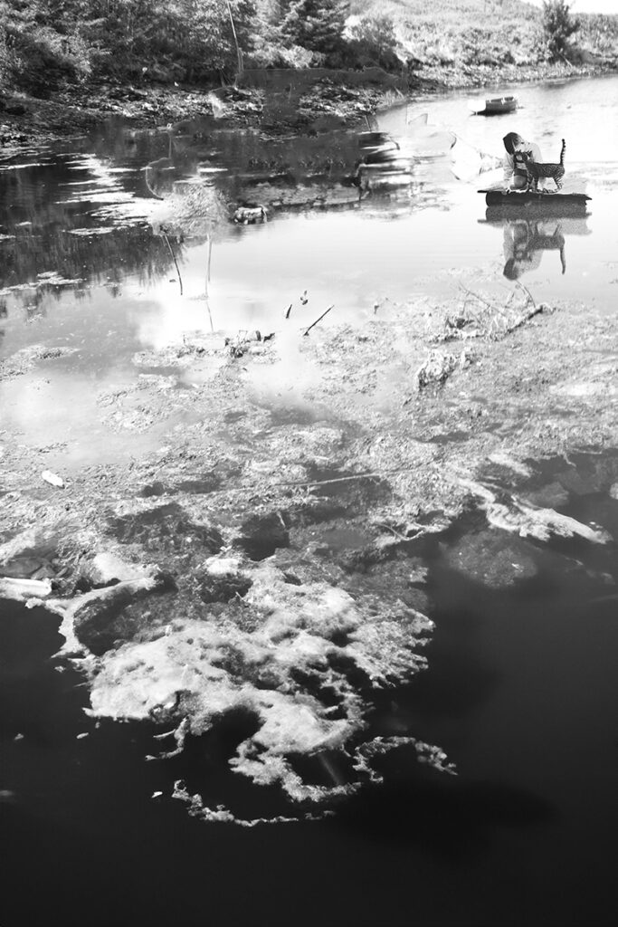
These test pieces focus on a single image treated in different ways. I chose to work with this image as the original photograph showed a boy and cat peering into a river or pond. This water theme is something I played with thinking as I did so of the river between life and death. I think the boy peering into the water is something which works well for me. It a thoughtful pose with no hint of fear and no sense he is being watched. I wondered about the cat and whether there a mythological element to this. I would have to do some research into that.
My final image in this sequence #10shown above is one I enjoy the most although I admit that part of that enjoyment comes from the fun in the making. I will revisit my editing as not yet entirely happy with final output. The image shows the boy placed in my photograph of a Scottish Loch with multiple layers of texture of seaweed, dicolourataion of water, and reflections of the clouds and hints of stones beneath the clear water contrasting with patches of still clear water.
As can be seen with view of original, I created the reflection on the computer and played with adding texture with a nod to an element of corruption.
I show this original as I been wondering whether a few select images I have found showed be used without editing and in their natural size and form. I will show more development of this idea next month.
I will show a series of test pieces and my thinking behind these based upon my research and on feedback as well as using the creative process as a way to discover.
In this month’s post I show work continuing my exploration into glitch art and the accidental corruption of image files on my home computer because of a video card which is no longer supported by Adobe Photoshop. I could change the card but like the accidental nature of these images over which I have no control. My tutor suggested that this could be aligned to feelings of death which for most of us, is outwith our control.
I also started to experiment with trying to manually create the glitches and in subverting the original images. I did this through using glitch tutorials I found online and learning how to manually shift the colour paths and channels in an image file. I also experimented with extreme colour and contrast shifts. Below I show a selection of examples of these tests.
In these works I ask myself, how do these images make me feel, do these speak to me of the liminal death space and do I like any of these pieces?
My favourite is corruption example #09 which I think I like because of its simplicity. The video card error has filled 2/3rds of the image with a red cast. Could this be blood or is it reminiscent of a sunset? The colour shift from red to original also produces an obvious barrier.
My image example #14 was originally a picture of the texture of velvet of chairs in a concert hall with the metal folding mechanism and armrest.I was attracted to the shape and colour but does this corruption speak to me of death or just of confusion? Does it need to be part of a larger work?
All in all, an interesting start but at the same time oddly unsatisfying. For this reason, I worked on some images using album images as an extension of the image I liked best in this test. These are shown at following link:
The course notes divide work for this month into 3 exercises and a research task looking at a case study. I find this too prescriptive so will cover them in my own way.
I have spend time thinking about my project. I would say this is the foundations for a plan but that a detailed plan lies ahead.
Part I – Observations on planning for Major Project
My chosen subject of the liminal space surrounding death is an ideal project to explore through the liminal medium of photography. Photography shows what is to come and that which has already passed. Photography is often used to try and preserve a sense of life when in reality it preserves a sense of loss. Having said this, how do I go about throwing the idea of the reason why I create my work to the forefront and at the same time don’t make this obvious or repulsive? If the concept behind my art is the basic idea of confronting our mortality, then how to engage with my audience through my ideas and the presentation of my work and at the same time how not convey the meaning until the end? Much here to consider.
It is interesting to me that one of the exercises from last month was to draft a project plan with detailed timeframes, a breakdown of costs and funding, practice and research outcomes and more. This plan, the coursework suggests, should be 1,200 words. I read this and have been thinking about it but it still feels way too early for me as if it putting the cart before the horse. In my practice, I don’t feel ready to detail such specific elements of my plan when I have not yet decided how my idea will develop. I note that one ask for month 2 is to revise that plan from month 1. It feels like one of the strange ideas we come across now and again with OCA coursework.
Before I can produce any kind of detailed plan I must first look at the most basic considerations for my project and practice:
keep working creatively, trying different ideas and techniques and slowly refining the visual expression of my thoughts.
As part of my existing experimentation, I bought an old photograph album and several job lots of old photographs and some individual old photos which interested me. One of these came from Germany and I wondered whether I would notice any obvious differences in the images which interested me, from ones I had used in the past from the UK.
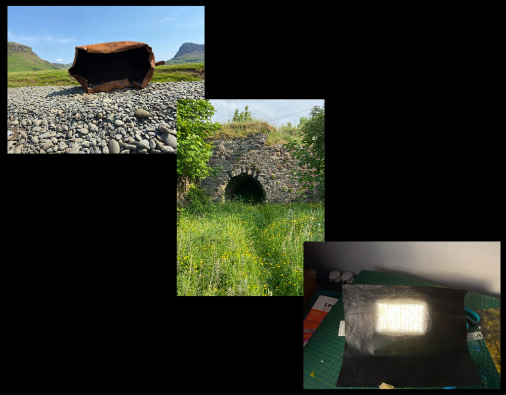
I also built myself a copy stand from a chopping board, some plumber’s pipe and a floor flange to which I added a clamp for the camera and some spirit levels. I will use this when I digitise the old photos and to ensure the work is level. Such manual tasks give me time and space to consider my practice as I work.
If, at the heart of my thinking is to build some form of exhibition around an idea, how would I present that idea? As part of this, I will research other practitioners
Research conceptual art and the idea of the presentation of an idea over a ‘traditional photography exhibition’
Research other conceptual artists using photography. This will help me think of my own personal journey.
My research, creative experimentation and then feedback and reflection, which I used in 3.2 will continue for my major project. One helpful suggestion from Jane Weinmann’s Case Study in the course notes was to “share your work and ideas often – even if you think it is not ready”. Another idea to “be open to ideas from many different places”.
I had thoughts around engagement with other artists and maybe residencies, and while I will look at these and do not reject such input at this early stage, it seems that these depend upon finding some basics about my work and the direction I want to go. One thing I have done is build a website, separate from my OCA blog. This is specifically to act as a way to showcase some of my work so that when I do need to approach outside partners, they have somewhere they can come to gain a sense of my creative interests.
Part ii – A worked example
My tutor described to me a conceptual art project. This was made by Scottish artist Douglas Gordon who works with photography, video and film. This particular work by Gordon is called “30 Seconds Text” and was made in 1996. It surrounds experimentation conducted by a French doctor, Jacques Beaurieux, into victims of those executed by guillotine. After the execution of Henri Languille in 1905, the doctor asked the severed head to blink to try and gauge residual consciousness of the head. His experiments showed that after 30 seconds responses faded. This is the same period a lightbulb is illuminated on some text in Gordon’s work. This work made me think about how long it takes to die. From that starting point, how long might it take to cross the River Styx from life to death? These two examples focussed on the dead person yet as my work has shown, the liminal threshold of death is not just a space for the dying but also for those who work with those close to death and those in the throws of grief. When I ask how long it takes to cross the River Styx, do I mean how long does grief last? Or how long before the rites for the dead have been completed and the living have found a resting place for their memories of the dead person and found a way to accommodate their own sense of grief? In terms of memory of the dead and of our own grief, these are all things which fade and eventually vanish leaving no trace behind. Visit an old graveyard and look at the abandoned gravestones, left to weeds and waste, cracked stone and erosion. Where is the grief for the people buried here and the memories of these people and what they once were? Is existence within grief a balance or seesaw with different aspects of life and of memory weighing down on either side of the liminal threshold?
There are some basic foundations in this example.
How long do the dead and the living exist in the liminal gateway of death?
Our loved ones and ourselves will all vanish from the world as if we were never here. What traces do we leave behind and how long do these last?
The passage of time and when we die or how long we experience grief are outwith our control.
Should art which tries to make sense of this part of life, our transient nature and our lack of control be controlled or created with the same transience and lack of control?
I have wondered about how to engage with my audience. I had thought of an enclosed exhibition space such as a boat in the dark or a coffin. Spaces the audience could step down into and which I could fill with a digital exhibition space. Are these ideas too claustrophobic? I also wondered in the past about placing a child’s coffin in an exhibition space and asking the audience to write memories onto pieces of paper and place these into the coffin. However, is the coffin, and especially the child’s coffin, too in your face and obvious? Am I forcing my idea down the throat of my audience? I wondered about how to construct an exhibition which was more collaborative and less obviously about me with more space for the audience. I mentioned the see-saw or balance at the very point of death and with my work arranged around this balance on the floor and walls. I could build a seesaw to form a centrepiece of my exhibition. The audience could be asked to write thoughts of death, loss, grief and memory and place their pieces of paper on either side of the balance depending on where on the balance between life and death their thoughts feel right. So, with the balance made from heavy wood, the balance would subtly shift as the weight of paper is so slight compared with the construction of a seesaw.
There is potential for a second part of exhibition, a retrospective where I decide what to do with the pieces of paper from my audience. If paper is very light such as rich paper, could the audience on the last day walk to river with me and throw the memories into the water? This would mimic the casting of Rebecca’s ashes into a river.
These questions are in part about time but also about our relationship with the dead and also with our own mortality.
I have been working on some creative test pieces which might not be an end in themselves but instead allow me to explore methods of working and different outcomes. I will present these for peer feedback and from there will be better equipped to pen a reflective statement of my earlky work in 3.3.
What does ethics mean to me in my photography and in particular to my major project? My project has obvious ethical considerations as I explore subjects surrounding death which might cause discomfort or psychological impacts to my audience. Is it enough to be up front and honest about what my work is about and then to present my potential audience of the choice of walking away or engaging with my work? I think that this would mean that my work must be presented in a way that this choice is available and my work should not be presented in a way that people who have not made this conscious choice could stumble across my work. This would preclude exhibitions spaces where public going about their lives such as hospital corridors, railways stations, outdoor spaces. It also means I would have to think carefully about choice of venue. For example, a hospital which contains the sick and their relatives. How might they respond to a project about loss. Similarly, if project shown in church hall used by the elderly. These considerations a balance as I also feel my work has beneficial element and can help open thoughts and discussion around death. Should this discussion element be part of the exhibition where audience have chance to feed back and to interact with the artist?
Just from my brief thoughts above, I think that framing my motives in a statement of ethics will help to evolve my practice over time. In my practice, I have to tread a fine line between what I want to capture to try to tell stories through my work, and moral considerations when I tackle subject areas which can be challenging and painful.
The points I raise above are the beginnings of an empathetic understanding of my project through the eyes of others and potential impacts on them. Part of this ethics discourse is about describing potential risks and thinking of ways to mitigate such risks. If my work challenges conventions, I need to find ways not to make my work less upsetting and more bland or palatable or ‘middle of the road’ but to recognise the potential risks to others and to see how such risks can be managed.
Ethics of my major project is something I will think on as I work and will return to time and time again throughout this year.