Having gone to the effort and expense of creating an exhibition, I wonder about the possibility of using this again in a new space, at a different location and at a different time. Might this become a touring exhibition? This would give me an opportunity to build upon the experiences gained during the hosting of my exhibition at Leith Makers. Might there be considerations on holding it in the same city and running into the issue of some of my audience having seen the exhibition already? I can imagine that it might be necessary to shift the exhibition to a new town with a different population. Next is an exciting part of trying to make my exhibition work in a new space. When I attended an exhibition at the Talbot Rice Gallery at Edinburgh University, I was struck by the spaces and how big some of them are. My exhibition in its current form would be lost in a small corner of such a space. In such a space, I would need far bigger works. Interestingly, the exhibition I saw there used huge projected video works on very large screens. It would be a very different presentation of my work to incorporate projections for all of my work. Another way forward, was I to gain access to such a space, would be to reimagine my exhibition and recreate it. This point about gaining access to the exhibition space is interesting as I wondered if I enrolled to study at this institution if it might open doors to such spaces. A consideration for moving an exhibition from one space to another is in packing, transporting, unpacking and assembling work. Who might do this? How far might the exhibition travel? This is an important question given the see-saw, which is bulky and very heavy. I think the idea of a touring exhibition is maybe quite advanced but moving from one venue to another is perhaps a two-step tour and any extra hops will follow the same pattern so maybe this might be possible. I found a guide of standards for touring exhibitions by the Museums Libraries Archives Council, which, although aimed at museums, has useful information. (Standards for touring exhibitions –, 1995) Touring Exhibition Group (TEG) have information on exhibitions, venues and more (Touring Exhibition Group, no date). And Shirley Read’s book Exhibiting Photography has lots of information on approaching galleries, exhibition spaces and more (Read, 2014)
References
Read, S. (2014) Exhibiting Photography A Practical Guide to Displaying Your Work. 2nd edn. Abingdon: Focal Press, Taylor & Francis Group.
Standards for touring exhibitions – (1995) Museums and Galleries Commission. Available at: https://collectionstrust.org.uk/resource/standards-for-touring-exhibitions/ (Accessed: 22 January 2025).
Touring Exhibition Group (no date). Available at: https://theexhibitionsgroup.org.uk/ (Accessed: 22 January 2025).
Much of the work I document concerns my creative choices surrounding my body of work and how these works fit into an exhibition. I recognise that this simplifies what went on in the process of designing my final major project and how potential choices of a book, zine or newspaper fitted into my project. An important piece of peer feedback from Barry Rourke and later on echoed by Giorgio Colanna concerned using books to show my work rather than an exhibition. The thought process behind this was that the pace of a book, of looking at an individual page of text or an image then turning the page, was a good way to approach my subject and to allow my audience time and provide a way to separate works. I had produced some photo books in the past using self-design books passed to printers but was far from satisfied with the final product. I started to investigate photo books, looking at the work of a previous student, Helen Rosemier, who devoted lots of her energies to creating a very fine self-published book. I started to look at the production of a book. In this, I was interested in the technicalities around this choice as well as how my final project might look and feel if I were to present my work as a book or as an exhibition, perhaps with some kind of zine or newspaper which my audience could hold and look at away from the gallery. Helen’s work represented an extreme, in my opinion, as regards the time and expense she devoted to this part of her project. Her crowd funding for this work reached over £10,000 before she was finished with this project. Her extensive work considering the choices of paper, text, picture layout, blank pages, cover design, materials and the decisions around self-publishing and funding these choices had to be balanced against the option of passing on some of the responsibility for the design of the book and with it, some of the creative choices, to an established print firm. Her final work is very beautiful and poignant, but this didn’t immediately point me in the direction of producing a coffee table book for my own body of work. At some level, I was daunted by the time Helen put into this element of her final project, but more than that, I questioned whether a book was the right creative choice for showing my work.
Some posts relating to Helen’s book, including the funding for this work and a review of the book are shown below:
I looked at a series of books of different styles and quality.
Firstly, a small book I found during my artist’s residency called “Silence is Forever”, made in 1990 by Bébert and showing the work of three artists, Jürgen Albrecht, Fred Eerdekens and Klaus Dieter Zimmer. The book is in Dutch and comes from a printer in Rotterdam. It measures 15.5cmx11cm and contains 25 pages, not including blank pages at the beginning and the end. The book contains eight images and eight pages of words. It is hand-stitched and is part of a limited edition of 450 books. The second of my images below shows the hand stitching and the know it the thread. I love how this book feels so comfortable in my hand with the simple choices of the binding, slipcover, text and graphics. It felt that this was very much a simple work which I could attempt although perhaps appearances can be deceptive. I note that the images in the book are monochrome and was concerned that my work, some of which is in colour, would jar with the simplicity of such a book.
The cover and some pages from “Silence is Forever” by Bébert
I next looked at a book produced by another fellow student. This is a lay flat, colour photobook containing 20 stiff-backed pages with 18 images or 19 if I include the cover. It measures 15cm x 10cm, so it is very similar in size to the Bébert book. It is, however, a world away in terms of the emotional impact of the presentation of the artwork and the words. In many ways, this reminds me of photobooks I made myself at an earlier part of my photography degree, but with far superior content. I enjoy the content of this book, and find the work to be very moving, yet for some reason, the book itself leaves me emotionally cold and dissatisfied. There is something too professional, maybe. Perhaps too glossy and stiff. The content and the presentation seem to conflict and disrupt the message.
Still looking for inspiration, I was given a zine by John Burns titled “Clare with the Pig.” This measures 21cm x 15cm, so it is larger than the other 2. It doesn’t feel in any way cramped and includes blank pages The zine contains 30 images and one page of text spread over 45 pages. John tells me that this zine was printed at Mixam using an inkjet printer. The zine is held together using staples. The book is very fine and presents an expression of the pathos of his mother’s life seen through the house she lived in before moving to a care home. I think the zine is very successful. I wonder, however, at the number of images. My final project for my exhibition contains just eight images, a video work and an installation. How would I expand on this offering to fill such a book, and in so doing, might this dilute my narrative and the force behind my story?
The cover and some pages from “Clare with the Pig” by John Burns
I looked at a series of paper and digital samples of newspapers from the Glasgow Newspaper Club. I like the look and feel of the digital tabloid in 80gsm bright recycled paper. To me, with a few images and some words, the newspaper provides me with the best option of accompanying my exhibition.
Lastly, I ordered a copy of Helen Rosemier’s book. The quality of this work shines through as does the effort spent in the construction of such a work. It is truly a work of art. The emotional impact in the high quality photographs and their presentation is haunting and powerful.
The cover and some pages from “Zones of Possibility” by Helen Rosemier
As I write this, my opinion today is that John’s zine and the small book by Bébert have a similar impact.
Conclusion. I admit that the effort and cost of making a photobook frightens me, but more than that, I wonder if this is the best way to present my final project. I read Anna Sellen’s padlet in the Graduate Case Study section of the coursework. She placed a very relevant quote regarding an exhibition and, by inference, the choice of the production of a photobook
“I wouldn’t necessarily say that exhibiting work is important, however, the steps leading to exhibiting work – including but not limited to editing, sizing, printing, editioning, pricing, transporting, framing, hanging – are all important for your professional practice.” (Michael Dooney, 2021)
There is an important difference between an exhibition and a book. An exhibition, put onto the walls of a gallery for a few weeks and then taken back down, has a temporality and lack of permanence, which seems to resonate with the story behind my work and with life itself being temporary and ending in death. A high-quality photobook has none of this and is solid and permanent. Having said this, I do feel that some kind of memento of my project is suitable and appropriate. I think of a friend’s recent funeral and the order of service with photographs and words celebrating his life.
Front cover of Gordon Davidson’s Order of Service
Some kind of permanent reminder that my exhibition was real and took place but is now no more. This idea seems similar to that of life. In my examples, the three I am most drawn to are the magazine and the zines by Bébert and John Burns.
Although I have rejected the production of a photobook preferring an exhibition, in addition to my choice as regards the exhibition, there are other printed materials which I think sit well alongside the exhibition and will compliment my work.
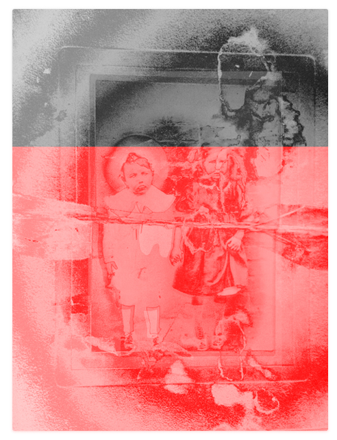
I show below some test pieces which I have been working on which will form the front page of my newspaper and also act as a poster for my exhibition. Some of these use images directly from my exhibition, in some I started to experiment with my exhibition title. I took a print and set fire to it and then layered some ash with my picture. I then photographed the ash left behind after my experiment and used this in some of my poster/newspapers trials.
I have revised this document many times as something about it hasn’t sat well with me and has been niggling away in my head. Even when I drove to the far north of Scotland, I took my computer and a copy of the text, which I continued to work on.
My latest version is shown below:
“My project is a deeply personal and emotional exploration of the spaces between life and death inspired by my daughter’s eighteen-month journey through cancer to her death and by my own parallel journey as I watched her die and tried to cope with life without her. Scatter is a project born from the desire to make sense of loss, which might, in some small way, contribute to the understanding of grief in society. Initially, I had no plan to show this project, but the healing process demanded that I reveal it and not lock it away in the dark. The artworks I have created to explore my experiences have the potential to provide others with a way to delve into their own depths of sorrow. I believe that grief is not something that can be cured; it is a feeling that never truly leaves us. However, my engagement with death and my gradual acceptance of grief have been enriched by the process of creating this project. Grief and art seem to be a good match; they provide a way to make sense of the raw emotions and turmoil surrounding death.
My daughter’s name was Rebecca. Although Rebecca does not feature directly in this exhibition, her presence runs like a thread through my project.”
I will ask for feedback on this before I settle on the latest version. Even at this late stage, I wonder about the line where I state that my project might contribute to the understanding of societal grief. Is this too bold a claim and should I remove it? Are these words and meaning repeated when I say that my experiences have potential to allow others to engage with their sense of sorrow?
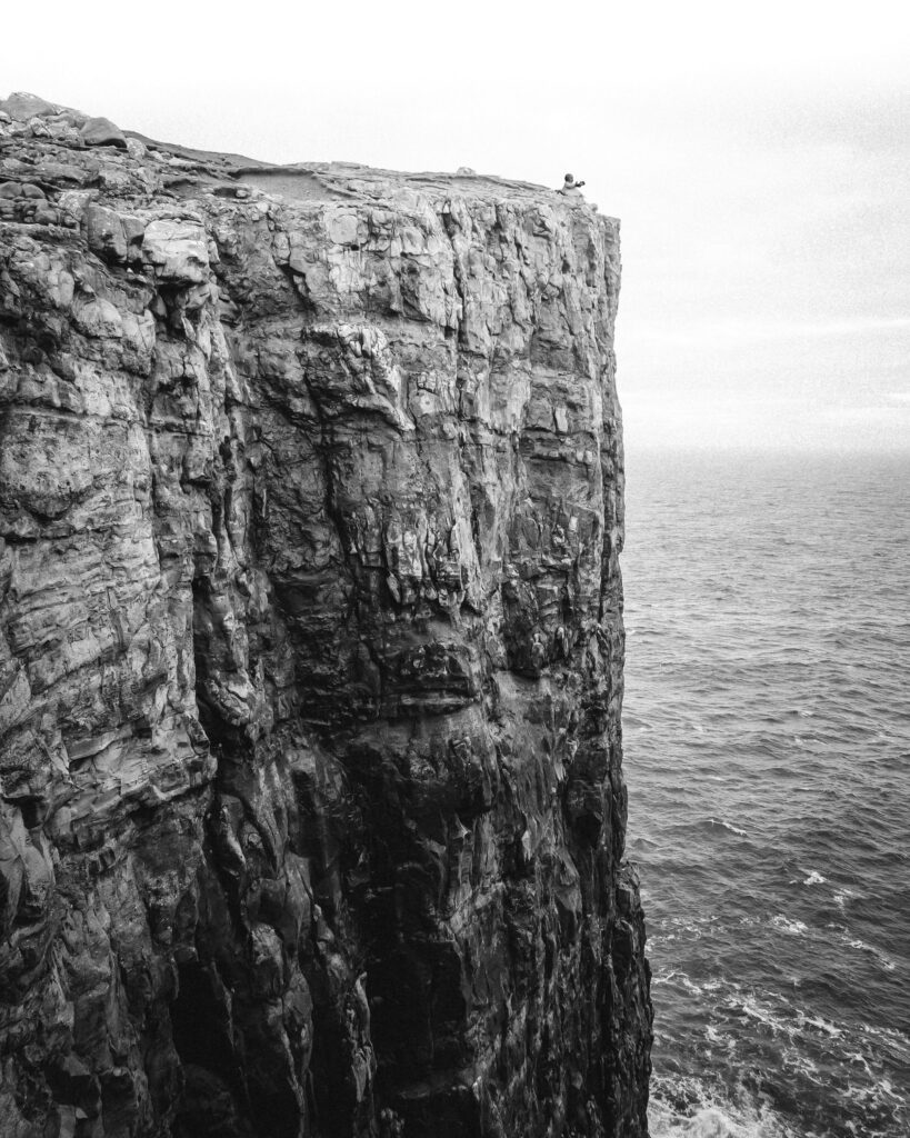
Late change. My picture featuring a cliff was taken in Ireland and shows the Cliffs of Moher. While this fitted with my purposes at the time I made this, the starting point for this piece wasn’t my work, regardless that I have shaped and changed the work many times. For my exhibition, it would simplify permissions if I just used my own work. I therefore researched some similar cliffs in terms of height, shape and approachability, looking to replicate the typology of the original piece. I found several places to visit in the far north of Scotland and planned a short trip. The cliffs I chose are near Thurso, Wick and John O’Groats. This is a 6-hour drive from home. Two days before my trip, my father died. This changed my trip as the time on my own in the car and out with the camera would become time for introspection. Lots of time to think about my work and the deaths of those close to me and of my research and creative efforts working alongside the sense of loss. It is also interesting to consider that the end of my degree studies could also be thought of as a time of loss. My father wanted to leave his body to medical research, so there is no funeral going to happen anytime soon. His body will be sent to Dundee University, and we are told that the funeral could be up to two years in the future. My sister wants some kind of ceremony to mark his passing, but to me, this feels odd. There is no funeral, no body, no wake, no gathering. It’s just a social media post suggesting we all light a candle and listen to hymns on YouTube. All with the knowledge that a real funeral is yet to happen. I don’t have a huge sense of grief right now, but maybe that will come. When I have a long drive or am working with the camera, my mind can wander, and this loss will be high up in my consciousness, and who knows what paths I might go down: memories of my father or family, ideas around my body of work which trigger other creative possibilities or thoughts of my future research or studies or of work in my chosen field of death studies or more.
Below, I show the original work from Ireland and two images which are very close to my original idea. In the original, the cliffs appear very white and darken towards the bottom. I have copied this idea in my first example, although not an exact replica. The texture of the rockface in these two attempts is very close. I note that in this example, the cliff edge was fenced off and it wouldn’t have been safe to attempt to cross the fence and try to descend the cliff I was on so as to change my perspective on this cliff I was photographing. For this reason I used AI within Photoshop to create a horizon close to where the horizon appeared in the original shot I used. I also chose a third piece, which has a different feel and where the darkness at the base of the cliffs is delivered through shadow from a nearby rock face captured in the low winter sun. Note that the third piece is in landscape format rather than portrait. The portrait format helps to emphasise the height and the drop of the cliffs.
Note that in these two test pieces, I have not added the child to the top of the cliff. I will decide on whether to do this just before I get my final selection printed.
I will ask for feedback on these works. The second test piece is the most obvious choice, yet there is something appealing about the final example, too.
I cannot overstate how important my understanding of the order and narrative has been to the process of building my exhibition. The feeling developed from insights gained during my artist’s residency in July and through subsequent discussions with my tutor that my narrative was unclear. I used my growing awareness about this narrative to test my project, which helped me to recognise where there might be gaps in my sequence and where several works conveyed the same message. I tested my growing appreciation of the flow needed to present my work successfully with feedback sessions with my peers and with my tutor.
I recognise that as I write about my narrative, the changes to my visual works and, later, to the titles attached to these works and to the introductory text, some of these changes have been subtle, especially as I near the end of my degree. Some of the works I have made have found their place in my sequence and need little manipulation, while some pieces felt wrong for different reasons, whether this was due to duplication of the message, the position within my sequence, whether the text describing the work needed tweaked and occasionally some creative work needed to be redone or pictures reshot. I will show below a final iteration of my exhibition but will include earlier choices and highlight why I changed my mind.
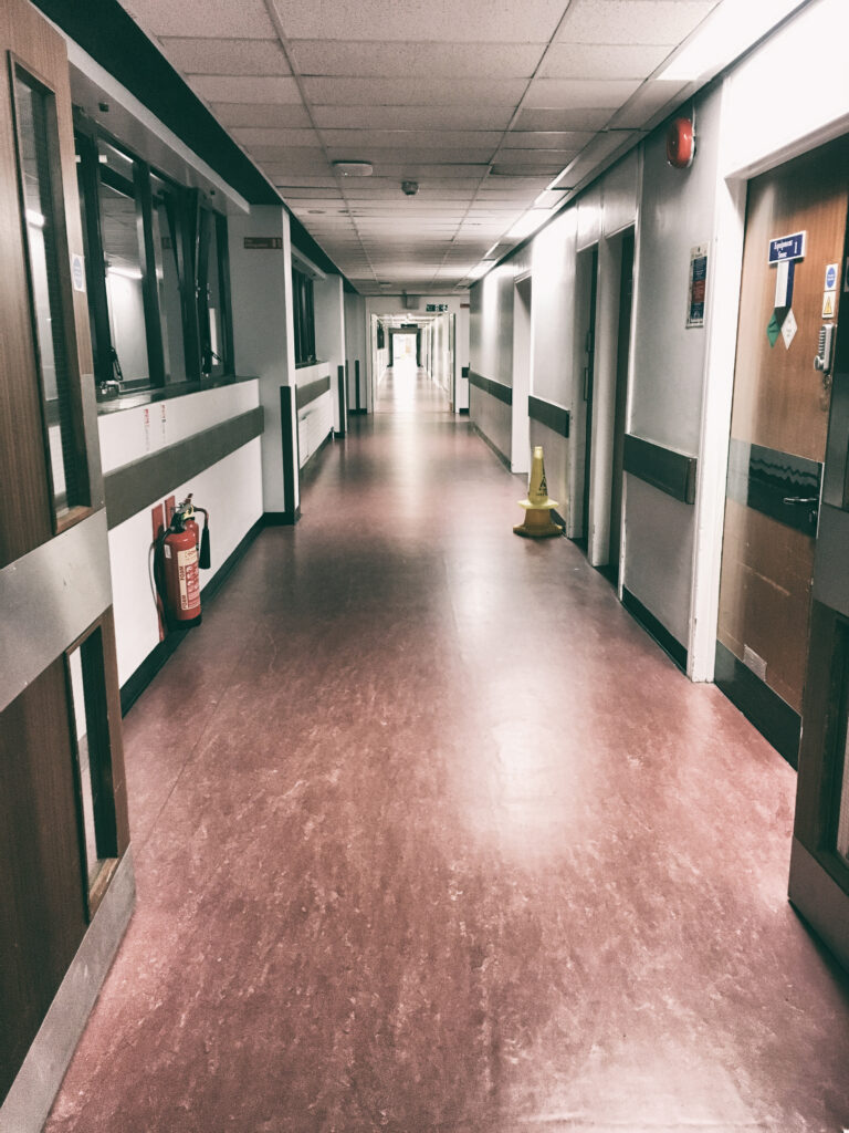
The initial work to introduce my project shows a hospital corridor with the white light of a doorway reflected and amplified in the floor at the far end of the corridor. I was fairly sure that this piece should be the first work in my sequence, and even the title did not change as my course approached the end. This gave my project a good foundation for choices to come. This work is titled “Hospital time runs very slowly”.
My second artwork shows a view from Rebecca’s hospital room, looking over the hospital buildings towards the Edinburgh skyline. Anyone familiar with Edinburgh will recognise this view, and anyone not familiar with the city should recognise that I show a typical hospital block. Early versions of this picture had a child placed on the roof of the building, echoing my idea in a later image featuring a cliff. However, I recognised that the height or shape of the building was not the important part of this element in my sequence, but instead, the view tied with my title, “My view”. This title has changed a few times as I slowly came to appreciate how these words, if more refined, helped the concept behind the image. Earlier titles included “View from my daughter’s hospital room” Later on, I rationalised how I referred to my daughter after feedback pointed out that sometimes I called her Rebecca and sometimes my daughter.
My third image acts as a pair with image two. I added this to my sequence as I started to question my narrative, trying to identify gaps. Initially, my tutor questioned why I had included this image as I wasn’t clear about what I was showing. At that time, my image was titled “Bedside Table” which was too descriptive and didn’t hint at any of the real story behind this work. The counterpoint between these two images is that one looks outward from the hospital towards the horizon from a standing position, while this image is about Rebecca’s perspective, confined to her bed for a huge amount of time because of the pain of her cancer. Much later, I changed the title of this work to “Rebecca’s View”
The fourth artwork is a new work I shot for this project late into the process of making sense of my narrative. This work shows a memory box Rebecca filled with objects precious to her when she knew she was dying. The box is under the bed in the spare room, tucked away out of sight. I have never opened her memory box. This work was initially titled “Memory Box” and came later on in my sequence. I experimented with this image in colour before deciding black and white best suited my purpose. A later piece of feedback told me that this black and white image was the first in my sequence when Rebecca was dea and was the first without colour. I hadn’t considered this so a valuable insight. Before this image, I was experimenting with an image of a get-well-soon card and a straight image showing the warning light outside the room where Rebecca received radiotherapy. Feedback told me that the warning sign was too descriptive and simple without leaving any room for my audience to make their own choices. I never pursued the work with the get-well-soon card as it felt too contrived to me and my project turned to a very harsh level of editing and stripping out all which was unnecessary or didn’t work perfectly in my sequence. The memory box work became “I Have Never Taken the Lid Off Rebecca’s Memory Box”
As I write this description, it is clear to me that I was unclear on how to close my project. I have made many changes to this part of my sequence, including my images and the text. There are works that I included for a long time, but I couldn’t find a compelling reason to fit these into my narrative and eventually rejected them. Such works include my selection of found album images and a memorial locket, which I show below:
Artwork five was my image of a cliff. At the top of the cliff, I placed a small child. I took a stock picture of a cliff and shaped and coloured it on my computer before eventually, happy with my work, going on to research similar sites so I could take such a shot myself and avoid any complications of using someone else’s work in my exhibition. This was originally a diptych, but I responded to feedback and asked myself if I could simplify this work without impacting the story it tells. It shows the mixture of discomfort expressed through fear of heights yet, at the same time, shows a happy child with arms spread as if welcoming this abyss and the liminal space at the border of life and death. My original title for this work was “The Abyss” which I changed to “The Precipice”. I have also taken the child out of my current shot as the cliff would seem to tell the story both with or without the child.
I note that in this example, the cliff edge was fenced off and it wouldn’t have been safe to attempt to cross the fence and try to descend the cliff so as to change my perspective. For this reason I used AI within Photoshop to create a horizon..
[Artwork 6]
As my work progressed, a natural divide developed between straight pictures, such as a hospital corridor or the memory box, and more conceptual pieces. Artwork six is my final ‘straight’ piece, although I had a further four pieces which were originally part of my sequence which I later removed. The woollen image came from a collaboration. The wool represents gifts given to newborn babies. I later realised that, while I liked this image, there was no fit with my narrative. Similarly, my image exploring memory showing a park bench. The other two photographs imagine a view from the banks of the River Styx as I explored what it might look like gazing into the liminal space. I finally rejected these as my image of the cliff replicated the message in these two works.
My sixth piece for my exhibition is my video work of falling ash. Rebecca’s ashes were scattered from a bridge where she had made her only bungee jump. Her doctors refused to allow her permission to do another jump when she was ill. The scattering of her ashes was a symbol of Rebecca’s last bungee jump. I shot this several times, sometimes using stones collected from the river under the bridge and then simplifying this work. I changed the rate at which the video sequence played, and after feedback that the ash looked like icing sugar, I darkened this work. This work will play on a loop in my exhibition. I have questioned whether to show work on a monitor or to project it on the wall. My preferred choice is a projection, placing the projector where my audience can get between the projector and the screen, and so become part of my artwork. This work is called “Scatter”.
Although I had experimented with this piece, it wasn’t originally part of my major project. Initially, I didn’t think a video piece would work in my chosen gallery. This only came into scope when I showed it to others and asked them for feedback, which forced me to think again about this piece. When I thought more about this work, I realized that obstacles and challenges in the gallery space were no reason to exclude this work.
My seventh piece has found a place in my exhibition for a long time, although originally, this didn’t have the block of red, which came from me using my home computer with a graphics card that is out of support for current versions of Photoshop. When editing, sometimes the graphics card would throw out glitches over which I had no control. This element of losing control felt like death itself, which, for most, is a sudden thing. This explains the title of this work, “The Abruptness of Death” The work started out as a found image bought on an online auction site. I edited this work, trying to create the sense of something uncomfortable and otherworldly before the accident with the graphics card added to this piece.
My next image is another, which uses a photograph I purchased online where the history and story of the child have been lost. I chose this picture as the child looks back over their shoulder at us as if asking a question. I cut the child from the original background and placed it on a black background, then added a sense of supernatural light above the child’s head. This idea was inspired by work done by artist Ken Currie.
This child has been part of my sequence, then removed, then added in again in a different form for quite some time. I saw something in the child I wanted to use but didn’t know how. When I saw how my paired images of Rebecca’s view from her bed and my view from the window worked, it occurred to me that there could be another image answering the child’s unspoken question. I titled this work “Are You Coming?”
This image, titled “Soon,” helped me make sense of the child in my previous work. I shot it at a gig where I was interested in the light playing over the audience. I took this photograph as the crowd looked the same way towards the stage as if they all had but one mind. I then simplified the light on the stage to make it similar to the light I used above the child’s head in my previous work.
My final work is an installation of a see-saw. This is made from a length of scaffold board and an old hinge, which I sourced and had sent to me. I have passed this to the local blacksmith to do some remedial work and make it more steady for a gallery setting, as I didn’t want it falling on anyone. The base for this piece weighs in excess of 37kg. I originally titled this work “Letting Go”, and while I like this title, my tutor introduced a different thought in that I might consider leaving this piece untitled as a suitable way to end my project, my exhibition and my studies at the OCA.
A composite image of the base and the scaffold board is shown below:
This section contains a series of posts, some of which have only occurred to me late in this process, related to the build and design of my exhibition.
I have now booked my exhibition and paid the gallery to confirm my dates in April. As my exhibition will take place after my degree is complete, I have produced this document to provide an overview of it and explain some of the choices I have made, whether I have taken these forward, rejected a possible choice, or parked an idea that I might return to in the future. I will show a sense of some of the challenges of building an exhibition.
The gallery I have chosen is not a white cube; it has a character that brings a sense of place and history into the space. The gallery is housed in a building that sat underneath a railway bridge that took trains into Leith Central Station. The railway, bridge and station are long gone, but a hint of the remains of the bridge can be seen outside on either side of the road and in the gallery, where the ceiling is made from cast iron. Downstairs, there is a shop that sells arts and crafts and some studio spaces which can be rented. Upstairs via a staircase is the gallery. There is no access for those with mobility issues. This space has a toilet and a small kitchen, a fireplace, and windows to the side and front. The fireplace wall is rough stone, while the opposite wall is a rough textured whitewashed surface. Taking note of these differences in wall construction, I decided to place bigger works on the longer wall with the fireplace and smaller pieces, which I thought would work well on the white wall. There are multiple power points on the walls and on the floor, which was important for me in case it limited where I could place my video piece. As the wall is textured, I am considering putting up a projector screen and shading some of the light from a window using a sheet. In the centre of the room, I place my see-saw installation. This forces the audience to walk around it, which means that they cannot cross from one side of the room to the other and must follow my sequence. I have placed my introduction where I hope my audience will start, but I recognise that some might look at this project in reverse. At the end of the room, near the toilet and kitchen, there are tables and seating. Here, I will place some postcards of my work and a newspaper/zine, which I designed and which also serves as a poster used to advertise my exhibition.
I show a plan of the exhibition space along with a walkthrough I created from the photographs I shot during my many visits to the gallery. As I was putting this together, I placed some footsteps on my image to create a sense of how I plan for the audience to move through this space. I did wonder about sticking some footsteps onto the floor of the gallery, but I expect people will do as they please, and I cannot control them. For the same reason, I have not planned to place a “Do Not Touch” sign on my see-saw as I expect that regardless of such signage, folk will touch it.
Some practical considerations on hanging my artwork. The gallery has a picture rail made from copper pipe. Chains and j hooks hang from the rail. I show images of these below.
My chosen mounts use an aluminium subframe, which stiffens the print and creates a gap between the wall and the print to make it seem as if the print is floating with nice shadows. I think this fits very well with my work as there is no border to distract my audience, whose attention will be focused on my work. I had to check the preferred method of hanging prints in the gallery to see if this worked with these subframes.
For the signage for introduction and titles for my works, I will create these at home, using adhesive labels printed on home printer then stuck to foam board.
The labels for my works will have following details, artist name, Title, year, medium and I will add a price to purchase the artwork.
Last month I was working with test pieces which explored a single image of a boy and a cat. I investigated uncontrolled glitch art and then moved my efforts using manual computer edits as I wanted to exercise more control. I then considered the scale and presentation of these pieces. As I was working, I wondered about presenting photographs from my growing collection of old album images. Could I present these as part of my project either unchanged or perhaps with minimal alterations to suit my project idea? How would such works sit? Should I arrange a collection or present a single image? What of scale, enlarged or at the real size of the original image?
Below, I will show a selection of these old album photographs, although immediately, I have to point out that what I show are my photographs of the original images, so they are not the same as the originals. The most obvious aspect of this is in terms of size, so I have included details on the dimensions below each image. Along with the works, I will present a description of what these pictures say to me. These photographs are unique and have a special feel. If I destroyed such a photograph, there would be no replacement and, other than through my copies, that person would vanish from sight. These photographs speak to me of loss in different ways: loss of these people’s names, their connection with place or family, the interruption of familial memory and of these people’s place with the story of their lives. These photographs, to my mind, express the very crux of the liminality of death as viewed through photography.
I also have some objects associated with death, some brooches, a locket with a tiny photograph and a lock of hair. I have photographed these and, like the album images I mention above, I present these in a very simple form free of the often severe adjustments to contrast which I often use.
The photograph above was taken by Smallcombe of Baker Street in London. It shows a baby upon what I assume to be the mother’s knee. The baby is quite sharp and has its eyes open, so I assume that the child is dead. The baby is photographed in a long white gown, perhaps a christening gown. The mother’s head is not part of the picture. When I first saw this image, it looked to me like the folds and drapes of the mother’s dress and the child’s gown were fabrics in the interior of a coffin. The mother’s dress as the sides and the child’s robe stretches to fill the floor of the coffin. The photograph has a haunting quality. I wonder what the photographer thought as he took this image. Why is the mother’s head missing, and why is the image presented with the edge of the mother and the background fading away to nothing? I assume that this was intentional and not due to fading or ageing. I have left some slight mould near where the mother’s head would have been, almost as a nod to her presence. The child seems to be fully in the liminal threshold already distant from the mother. Slipping from sight. It is an image which speaks to me of the view from a different perspective where things linked with life are fading.
This photograph shows a boy and a girl leaning against a tree with other tree trunks in the background and a darker space leading deeper into the woods. The photograph has a bold 1cm border with a scalloped edge. On the back of the print, someone has written, “fur Max + Kathe”. This photograph was in a series I bought from Germany. Other photographs in this group were dated from the 1930s. I have darkened all of the areas behind the children. As if the children as going deeper into the woods or have come out to look at us one last time. The children place one hand each on the tree trunk as if in communion with the trees. I did some work with fellow student Caroline Black, where this commune with the trees was part of our shared work. I imagined the boy and girl as Hansel and Gretel, which is a fascinating and dark tale thought to be based on the fact that because of starvation, people abandoned their children in the forests. This piece further explores the ideas we played with in our shared work.
The image above shows a photograph of 2 old ladies set in an album which uses brown paper. I show size above for the photograph of the ladies although my image showing half of the photograph before and after is bigger. The women in this image are dressed in long, dark dresses and hats. The image itself is dark, and I wondered if there was an element of mourning wear about their dress. One of the women smiles for the photographer while the smaller and older woman looks stern. The photograph seems to be the last in the roll of film, and a bold line cuts off the right-hand side of the photograph with 2942 written on film. This bold line made me think of the liminal boundary. The photograph of 2 unknown people who are now dead and forgotten and have moved beyond that white line. In the liminal sense related to death, who might have written that number, and what might it mean? I wondered if it might be a ticket number to cross the River Styx. I have photographed the album deliberately cutting off the picture before and after the 2 ladies. I wanted this to appear to be like a production line.
I have used this photograph before, but I wanted to show it in context. The photograph of the child is presented in a folded card with Santa on the front cover. Opening the card, I find a handwritten message, “To Aunty Jean and Uncle Cecil with all my love. From Baby Andrew“. Folded that card measures 15 x 10cm and unfolded 15 x 22.5cm. The photograph and card are very dirty and marked. I can remove the photograph and see a cleaner colour both on the card and in the corners of the photograph. There is no date or other mark on the back of the photograph, so we are left to wonder about Aunty Jean and Uncle Cecil, who appeared to keep this card for a long time for it to attract so much dirt. Was the picture well handled, perhaps by cousins, or did Jean and Cecil have no children? What became of Baby Andrew that this picture of him as a child survived? Did he get sick or die and so the image became very precious? This is what many do when presented with photographs with a limited story. We invent things to fill the gaps, perhaps built from our own experiences.
This picture is all about the tear for me. Who or what was in the other half of the photograph? Why was the photograph torn, and why so roughly? There is a partial message on the reverse, which makes little sense as it is incomplete, but I decided not to include the message as the simple fact of the tear without words was enough for me. The boy looks towards the unknown. Unknown for us, not for him. Is he looking out of the window, or is there a figure there in that gap? Yet if a figure, there is no sense of contact between the boy and the other. The boy is isolated, torn apart from something which hovers just out of sight. The tear is a liminal boundary.
I bought this locket in an online auction. I think it is from the Victorian era, so it is over 100 years old. The case is in some kind of metal and is patterned front and back. Inside is what looks at first glance like a torn photograph of a young woman from the shoulder up wearing a wide-brimmed hat. On closer inspection, a small pale image of a baby has been placed next to the woman. The ephemeral nature of this pale image of the child speaks to me of the fragility of a young life around which no stories exist and few memories are created. My picture shows the locket open, and on the other side of the photo of the woman is a lock of blonde hair. The woman in the photograph has dark hair, so is the lock of hair from the child? I wonder about this locket. It is very fine with a loop for a chain to be worn around the neck. Was the woman and child memorialised for her husband or maybe a sister or her mother? It makes me wonder what happened. Did the child and mother die in childbirth? What stories can I build, and how can I fill in the blanks from such an object shorn from its home and family?
It was a change for me to produce these works where I have consciously tried not to put in too much. I try to keep the unspoken story in each image fresh and without making anything too obvious. The words above are my own sense of meaning, but I imagine others will have their own take. I will seek peer feedback on these works and will also look at framing and how these images would look if grouped together. I might create a small digital exhibition to gain insight into how such works might look and feel.
To expand on the feedback from my peers working on the 3.3 unit I also asked for feedback from a wider cohort of level 3 students at a critique session. Comments from that session are shown at the following post.
I started to explore glitch art and computer generated faults with patchy success. I used one of these corrupted images which I was most happy with to pursue a slightly different path.
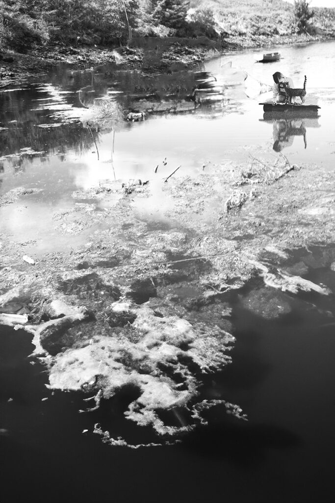
From this starting point, I added to my collection of old album images, finding some which appealed to me on eBay. I wondered if part of what I like in above image was the starting image rather than the corruption? I chose another interesting picture as a different starting point in some pictures I got from Germany showing small boy and a cat. I mention Germany as the boy is wearing tradition clothing. I enlarged a section of corruption in red from another image and layered image so that boy and cat most clear with background washed out and the water at bottom of image covered in red.
These test pieces focus on a single image treated in different ways. I chose to work with this image as the original photograph showed a boy and cat peering into a river or pond. This water theme is something I played with thinking as I did so of the river between life and death. I think the boy peering into the water is something which works well for me. It a thoughtful pose with no hint of fear and no sense he is being watched. I wondered about the cat and whether there a mythological element to this. I would have to do some research into that.
My final image in this sequence #10shown above is one I enjoy the most although I admit that part of that enjoyment comes from the fun in the making. I will revisit my editing as not yet entirely happy with final output. The image shows the boy placed in my photograph of a Scottish Loch with multiple layers of texture of seaweed, dicolourataion of water, and reflections of the clouds and hints of stones beneath the clear water contrasting with patches of still clear water.
As can be seen with view of original, I created the reflection on the computer and played with adding texture with a nod to an element of corruption.
I show this original as I been wondering whether a few select images I have found showed be used without editing and in their natural size and form. I will show more development of this idea next month.
I will show a series of test pieces and my thinking behind these based upon my research and on feedback as well as using the creative process as a way to discover.
In this month’s post I show work continuing my exploration into glitch art and the accidental corruption of image files on my home computer because of a video card which is no longer supported by Adobe Photoshop. I could change the card but like the accidental nature of these images over which I have no control. My tutor suggested that this could be aligned to feelings of death which for most of us, is outwith our control.
I also started to experiment with trying to manually create the glitches and in subverting the original images. I did this through using glitch tutorials I found online and learning how to manually shift the colour paths and channels in an image file. I also experimented with extreme colour and contrast shifts. Below I show a selection of examples of these tests.
In these works I ask myself, how do these images make me feel, do these speak to me of the liminal death space and do I like any of these pieces?
My favourite is corruption example #09 which I think I like because of its simplicity. The video card error has filled 2/3rds of the image with a red cast. Could this be blood or is it reminiscent of a sunset? The colour shift from red to original also produces an obvious barrier.
My image example #14 was originally a picture of the texture of velvet of chairs in a concert hall with the metal folding mechanism and armrest.I was attracted to the shape and colour but does this corruption speak to me of death or just of confusion? Does it need to be part of a larger work?
All in all, an interesting start but at the same time oddly unsatisfying. For this reason, I worked on some images using album images as an extension of the image I liked best in this test. These are shown at following link: