I attended two OCA Keeping Up Momentum sessions run by Photography student Helen Rosemier along with Fine Arts tutor Hayley Lock which ran over two Saturdays, the first on 29th October with follow-up on 19th November.
The theme of these sessions was “Something Missing”.
The session started with a long presentation from Hayley Lock on various artists working in this area in different ways and exploring a range of ideas. I won’t cover this presentation in detail here. The presentation is shared from the Padlet link – https://oca.padlet.org/helen416376/b5udu29ilhyu5gtp
At end of session one the class divided into teams to work collaboratively. I was paired with two fine arts students, Nats Davy and Beryl Hawker. Our team name was Team Roni Horn. This collaborative effort was to explore any of the following themes –
- Black and white
- Something and nothing
- Absence and presence
- Material and immaterial
- Marks and Traces
- Performing the invisible
- Transience and becoming
- In and out
- Positive and negative
- In and out
- Space around and in between
- A cast or something casted
- Forgotten and the displaced
- Fill in or remove
- Documenting the unseen
- Shadows or trace elements
- A marker of time past
- A marker of future present
Hayley Lock asked that we think how we might document the making and presenting of our ideas. Think about how you we explore as well as take risks with the work created together to discuss new ways of working and thinking. The expectation was that our team would agree on how to introduce work that has been developed relating to chosen topic, talk of any material engagement or processes that were undertaken and perhaps share working processes that led to specific work within the group on your topic reflecting on what has been learnt or developed across the time given to the task.
The timescale for this task was 3 weeks and at next session on 19th November we had to present our ideas.
The ideas which immediately jumped out at me from list were, “Forgotten and the Displaced”, “Documenting the Unseen”, “A Marker of Time Past” but after discussion we agreed to look at the idea of “Absence and Presence”.
We had very different ideas from the start based around themes of absence, memorial, death, and loss of environment, but all under the umbrella of ‘loss’.
At this initial planning meeting we agreed to explore a body of work where we would pass works between us and then respond with a further works derivative of what had gone before. This design of how the creative elements would be produced seemed to us to fit with our remote locations and our different ideas. Although our initial thought was that the works we produced would be passed from one to another but as we worked the realities of our different circumstances, our very different ways of working and the speed of response impacted initial plan. As it turned out, we were very flexible and adapted to these changes and worked around one another. This was interesting part of the collaboration, the changes to our practice dictated by dealing with others and aligned to the 3-week timescale for the project. One thing to mention is that it feels odd trying to describe our process in this linear document when our process wasn’t linear.
I began our collaboration with two existing works, the first was a photograph of a beach in the mist with a solitary figure barely visible at the edge of the mist. The thick mist hides the sea and whatever lies beyond the beach. I judged that this work fitted well with the idea of absence and presence and bridged the gap between the emotion of personal loss and of environmental loss. I passed this work to Nats whose personal interest lay in the area of environmental loss.

(Image ‘Missed’, photograph, RD, 2013)
My second work came from my current Photography 3 project and shows a memorial bench and the transparent figure of a child rescued from a photo album which explores idea of memorials for the dead and the missing and of how, as a society, we can forget those who are dead or are no longer present in our lives. Who stops to look at what is written on the plaque of a bench and consider the life of that person? Who or what does the child represent as it turns and looks at us? Is there a connection with the person to whom the bench is dedicated or a connection to us? This work is to make the audience consider their own death. Who will remember any of us? I passed this image to Beryl who was interested in death and loss.

(Image: ’Memorial #6’, photograph, RD, 2022)
At this point the flow of this document starts to fragment as there was so much interaction and things going on at the same time. I will show the creative responses and mention some the artists of particular interest to our team. I also include our words as this was important part of process, not just producing works but describing how and why we have made our creative choices. It was interesting to observe what inspired others at a very close distance and to see how these were reflected into their practice and the creation of works.
Based on my photography of the beach in the mist, Nat responded using charcoals and inks
“with her own style and processes to add even more to the sense loss, loneliness, searching for a replacement to loss, but not finding it. She added embodiment techniques by using her hands as primordial tools with charcoal, to offer a sense of human touch, caress, and nurture within a dark and lonely world when one has loss in their life.”

(Image: ’Searching’, A3, mixed media, ND)
Beryl went offline for a while as was having computer issues so Nat and myself continued this process. I responded to Nats charcoal and ink work with the piece below.

(Image: ’Searching #2’, photocollage, RD,2022)
“Using a strange amalgam of the drawing and another photograph. My photograph had 4 main features: a beach, the sea, and the sky with an island on the horizon. I flipped my image and generally experimented looking at cutting out parts of image to have parts of image visible. This version I adjusted the opacity so that the texture and marks from Nat’s image became part of the new image. At back of my mind, I wondered about removing more of the visual elements and just having a texture but not sure on this yet. I applied a series of photographic filters to the chosen image which is what turned the sea white. This all done on the computer.”
The work seemed to take on an icy feel to it – chilling thoughts of being alone, coldness and the uncertainty and emptiness of loss.
I produced various versions of this image which seemed to generate different feelings along with the shades and filters used but I sent just two to Nats and Beryl, the icy image above and the image below which made me think of the night and of things hidden in the darkness. This image feels much closer to Nat’s version but taking it a further into feelings of darkness, despair, and fear of loss.

(Image: ’Searching #3’, photocollage, RD, 2022)
Meanwhile Beryl had been looking at the work of Kerry James Marshall which she felt was helpful,“as it is full of layers, sometimes framed with flowers etc around the border and with strong contrasts of tone. I have used transparent layers and contrasting tones to give the impression depth, distance, connections, and fluid transitions.”

Kerry James Marshall Vignette 19 (2014)
Beryl used a photograph of a grave of a friend in Nepal as inspiration adding to her feeling of death within loss.

Eileen Lodge Gravestone, Nepal
“Eileen Lodge, whom she worked with, devoted her whole life to nursing and providing for leprosy sufferers in Nepal, setting up two hospitals and training centres, and clearing jungle to build small villages for them to live in and start a new life. She took Nepali citizenship and was cared for in her old age by her Nepali and buried in the garden of the first leprosy hospital she built which was called Green Pastures – hence the Bible verse”.
Nat then produced some work based on this Nepal photograph creating working drawings of mark making grave rubbings and the use of text to incorporate an added feel of the memorial, and loss through erosion.

(Image: ’In Memory of’, A4, mixed media, ND)
Nat further developed this work adding in elements of my original imagery, by overlaying it in sections, pushing and pulling the mediums around it.

(Image: ’Least We Forget’, A4, mixed media, ND)
Nat felt the work was looking too busy and wanted to reduce it down so produced following development, abstracted the work further and trying to replicate the bars of the memorial bench, and incorporate elements of the lost nature in the previous imagery. This resulted in more of a burning / charred feel which could be connected to the phase ‘ashes to ashes’ and a stark feeling that loss is something irreplaceable.

(Image: ’Ashes to Ashes’, A4, mixed media, ND)
Beryl then responded by combining both of mine and Nat’s work with some working drawings, see below –

(Image: Preliminary sketch, pencil on tracing paper, BH)
Beryl continued the work as shown in stages below –
She drew this image on cartridge paper with Posca pen and oil paint mixed with cold wax. The word LOVE was cut out of masking tape and stuck onto the paper then the paint was applied with a roller, brushes, finger, and palette knife, introducing bright white light and colour to portray the person who appears to be missing running joyfully into the light. Love bridges the gap. The tree and distant shoreline indicate the ideas of loss of environment, felling of trees where birds nested, and insects found a niche.

(Image: ’untitled’, mixed media, BH)
This worked developed to a finished piece shown below.

(Image: ’untitled’, mixed media, BH)
I then produced a work based on Beryl and Nat’s responses.
“This work took the tree and instead showed the brutality of a tree stump. I took the archway of light with the child and used this as a gravestone. I used some infra-red photographs which gave the foliage and grass a surreal colour then applied filters to remove colour and made the graveyard seem other silent and undisturbed which is often how these places seem to me. I added the gravestone from Beryl’s work and lightened it as if it was caught in moonlight or maybe the stone made from a white rock. I then used the shock of a red gloss frame against a textured black background to form the kind of memorial which might have been found in a Victorian home.” I have to be honest and admit I am not convinced by this work but at the same time this self-doubt is a normal part of my own practice just without the time for consideration and shaping and altering this idea.

(Image: ’Memorial #8’, photo montage, RD, 2022)
I made one further version of my image after end of our collaboration. In this I was influenced by the work of Siebren Versteeg and the work, “Neither Here Nor There (2005). This is a video which shows a seated figure playing a games console and slowly pixels shift from this figure to build a new person. My link below is to the video on Vimeo and I also show a still from this work. Versteeg’s work made me think about the gap or space involved in loss and in absence. Translating this into a space within my work that represents an emotional loss or a gap in memory is what motivated me.

Siebren Versteeg, Neither There Nor There, (2005)
I was fascinated by idea of stripping away the figure pixel by pixel. I imagined this without any reconstruction. My process showed the carefully worked upon collaboration, the reason behind the construct, the people and the graves and the memorial in the red frame have all been forgotten and replaced with a mirror. This mirror is now broken.

(Image: ’Memorial #9’, photo montage, RD, 2022)
Moving back from my re-work of this image to Nat’s sources of inspiration. She said she was influenced by the work of Silke Otto-Knapp telling us she “found the calmness, embodiment and monotonal qualities in work of Silke Otto-Knapp useful, which helped inform her processes and ideas of minimalizing and lowering the energy of her own work down.”
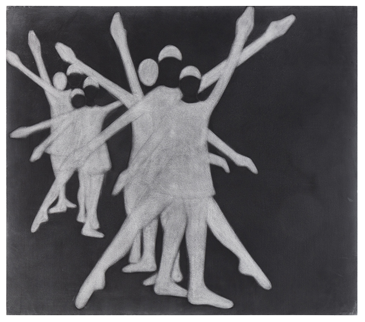
Silke Otto-Knapp Group (Formation), 2020

(Images, ‘On This Day’, ‘On This Day Imagined’, On This Day Relection’, A4, Graphite, ND)
My personal response to this exercise. I found it a rushed and, in many ways an exhausting experience with little pause for thought or reflection. At the same time it allowed me to see my own work through the hands and eyes of other artists as part of their own practice and had exhilarating episodes. So a very worthwhile thing to do.
I found the work Beryl looked at by Marshall which spoke to me of life and colour and movement and interaction but as a counterpoint the way that image is framed around plants was reminiscent to me of plants and flowers which are symbols used to represent death. It was less of a visual sense of loss or absence for me than a way to engage with the idea.
Beryl had quite a religious version of my and Nat’s work exploring the idea of a gateway and the afterlife. Whereas I reject the idea of a gateway to a ‘better life’ this work was an interesting development.
I was equally intrigued by both Beryl and Nat using text in their imagery. This is very interesting but is often something I shrink from in case the audience eye is drawn to the written word which creates a different sense of balance in the work. In my final work where I use a very modern red high gloss frame and strip back these words and turn the gateway into a gravestone but one where it might be picked out by moonlight or made from a pale stone. There could be a sense of brutality in taking another’s work and changing up for our own purposes so radically. It implies trust.
I had an immediate response to Nat’s work which I felt much less with Beryl’s. Maybe this in part was my unconscious response to the religious element. This is interesting as I loved the process Beryl explained of her image where she created that gateway with the child. Maybe in part it was her choice of the word ‘Love’. Along with the religious element it made me uncomfortable. This doubt in my mind is maybe why in my final work I stripped away such text. It would be interesting to hear from Beryl and from Nat what they thought of our collaboration. For me I felt this exercise was very successful and pushed me in very different directions from how I been working in past year.
Both Nat and Beryl spent time describing their process and materials. I felt in many ways that their fine art was a dark art of which I had no experience. In my presentation I described this thought as being the junior partner.
I very much enjoyed this process and it is something I would happily explore further.