In feedback last month, I discovered the idea of the liminal space. I have conducted some research into this concept. The test pieces below are early explorations of this idea.
In terms of my project, the liminal space is a threshold between life and death but, at the same time, of neither life nor death. It is a contradictory space which might be thought of as out of balance and which is stressful and uncomfortable. Those two words, stressful and uncomfortable form the foundation for my test pieces.
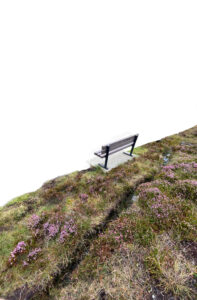
My initial three test pieces use a photograph I took of a bench which is in front of an inspiring view.
Initially I added colour and texture as if the heather were soaked in blood. I did this roughly so that at edge of my image the original colour is still present as that idea of a partially completed image which might offend the senses and seemed to fit with my idea of discomfort.

The second and third images use the same view but I have stripped out more of original image replacing it with empty white space. Note that for purpose of displaying image on this webpage with a white background I have added a black border to these two images which is visible should you click on the image. I am aware that this border changes the feeling of the images.


My next two trials strips away the scenic view which I have replaced with an abstract image of some plaster I shot on a bare wall. In second of these, I used another image of plaster with the bench, removing the colours and using filters to produce abstract shades and form. Am unsure if the plain plaster wall works and if the dischordant sense of a viewing bench next to something the mind struggles to make sense of manages to reach the sense of liminality I am striving for, however, these images almost get to the sense of discomfort I want.


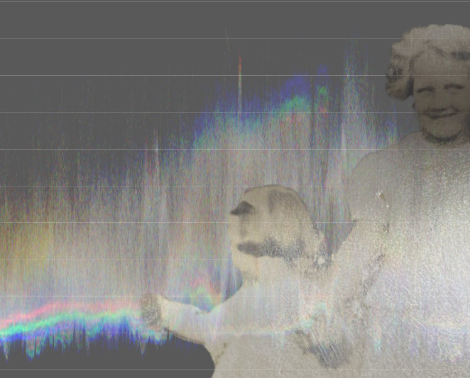
My final two images make use of found family album photographs. One I previously used with an image of a memorial bench is placed over a distorted plaster wall. The second is placed over an image I captured from histograms which come from a video I shot of a river. My idea here is the digital form of a river and of two children one of whom looks over her shoulder as if at the other side and one looks towards the camera. I think these two images with children added to my attempt to create a kind of non-space for the background are the most powerful of my trial pieces. In my opinion, using real people with gestures and emotion is a better way to get over my ideas rather than just a view with no people.

