I expanded my previous month’s creative works and research into liminality and have produced some more creative test pieces to explore this concept.I have looked at the liminal space as both a created uncomfortable space but also as an experience using real landscape photographs. In these I have explored the discomfort of the ‘death space’ in terms of a child on the edge of a great drop.
My first two examples explore the corruption of the physical space in the home represented by bare plaster work. In one image I have left child almost camouflaged mixing with the tones and shapes of the background. In next image I show a bright white which frames the child. I then shift my approach slightly to place figure over a landscape. Again I edit image to try for idea of discomfort and perhaps un-worldliness. My image with the landscape uses the image from plaster as a texture.


 I then decided to explore the colour image but this time with no corruption. The discomfort of the image is from a child in a vulnerable position on the edge of a waterfall. Am uncertain on my use of colour here. This is my only use of colour in this set. Does it work when mixed with child in monochrome? I deliberately left this in to see what this image looked like as part of a set but have changed my mind on this many times.
 The next 3 images develop the idea of the child on the edge of a waterfall but this time using a sea cliff.

I decided the image above was too ‘straight’ in terms of being a nice photograph of the cliff rather than my idea of liminality and death. I cut the image to try and emphasise the child. I then added height and the sense of the drop back to original photograph but in a simple graphic form. Finally I removed the cliff from the image.


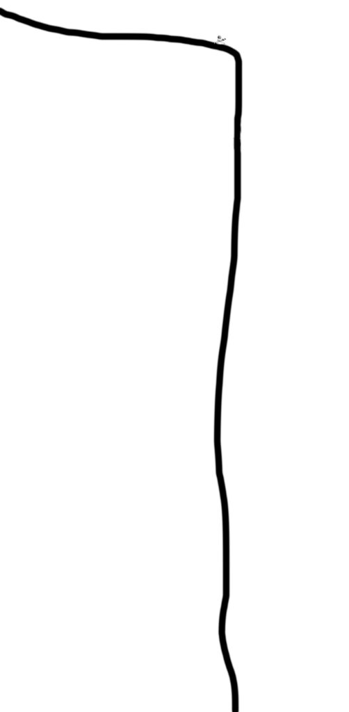
I ended with some trials of stripping out the cliff and leaving just an outline.I have deliberately left image shown here with no border as where is the boundary of liminality?
This month has been interesting period where I tested my images in different formats. I looked at letterbox formats when exploring idea of a river and of a cliff but the figure in my images became almost a minor component. The format of the cliff above using a bold graphic detail was, I felt, an interesting way to try and focus attention away from the cliff. I have also started looking at images of groups of people rather than the individual so see how this changes the feel of my work. I will produce more on that next month.