The course notes asks the student to produce a short reflective commentary outlining the development of my ideas during my work on this part of the course.
My major project is developing in concept and in execution. The developement of my project is a fluid process which uses repeated cyclical iterations of inspiration, research, feedback, reflection. As I work through this process time and time again, I sometimes experience doubt in my work and in my own sense of worth. This seems to be a cyclical feeling which comes and goes with my mood, whatever going on day to day, with notable anniversaries and with the progress of my project. I approached one of my peers to discuss this as loved her expression of a project which addresses death, loss and grief yet also conveys the sense of hope. This mental struggle maybe does not sit well with question asking the student to think of the development of ideas yet, for me these feelings exist at the core of my work. It is helpful to discuss these thoughts and to bring them into the open.
It is difficult to produce a logical equation for how my ideas emerge and come to fruition. An example of using feedback will change depending on what the feedback says and what my reaction to this feedback might be. The research and looking at the works of others is a valuable part of this process for me. I will attempt to pull this commentary back from the abstract to the nitty gritty of my project as it develops. I had wondered if by project 7 everything would be settled but this turns out to be incorrect. Yet I do not feel I am behind in my work. I am happy with most of my project including the idea of using physical objects to end my exhibition even though I have had to overcome challenges and don’t yet hold these objects in my hands. There are still challenges to overcome as I am undecided about the end of the photographic element of my project. As I have already said earlier in this post, I recognise that I might not be able to resolve this to my satisfaction. I have been continuing to create works and to ask for feedback although I do not always see these as fitting into my major project. This creativity, I feel, is a necessary part of my process and keeps me thinking about different choices and the reasoning behind these and behind the works I have picked already. One interesting thing as my undfergraduate study comes to an end, is where I receive feedback in the future outside of the OCA. There is an alumni group which I am part of and the current senior students have already spoken about posibility of keeping in touch and in continuing some of the sense of fellowship we have within the OCA.
Create a tightly edited, sequenced series of images with attention to use of text. This will form the basis for your Project 7 assignment and tutorial. You may have continued to shoot and/or make images; you may have changed direction since your last feedback report. However your project has developed, make the development clear in the image selection.
Pay particular attention to how you will use words alongside your images (captions, titles or additional ‘relay’ type text) and re-frame your images accordingly.
I have spent quite some time trying to refine my creative work so as to create a cohesive sense of flow and narrative. While I am happy with the beginning of my project and how I shift from more literal pieces to more conceptual works, I have been finding it very difficult to find a satisfactory way to close my project. I still don’t have an answer to how this project should end and have started to wonder if the sense of closure I am looking for will remain elusive. The feeling of my work being incomplete reminds me of my own experience of grief and attitudes towards loss revealed in my research. Jane Littlewood writes about the death of children, “Parents tend to remember their dead child at certain times during their lives because of the developmental milestones the child would have passed if s/he had survived. In this sense parents of either sex rarely, if ever, fully come to terms with the death of their child.” (Littlewood, 1993, p. 147)
When I last compiled this sequence, I added some new pieces to my selection. I am still creating works and coming up with new ideas, both individually and as collaborative works. My tutor provided me with a framework and reasons for what I should seek to achieve through a careful selection of works and the sequencing of that work. She said that the purpose of producing a coherent order for my major project is to identify repetition, connections and flow of my work and importantly, to see if there are any gaps. To aid me in my search for my ‘perfect’ sequence, I have printed my works so I can take them from my computer screen and place them around the house and see what they look like in analogue form. In addition to the order of my work and what to include, I have been looking at printed materials to accompany my exhibition. The exhibition might just last a few weeks and then be packed up and vanish. I wanted some printed brochures whether a booklet or zine to outlast my exhibition and provide proof that once upon a time, I held an exhibition.
Title
Working titles “Epitaph” or maybe “Memento Mori” or an off-the-wall choice might be “The Present is Also Valid as a Thankyou” (this is a translation from a poster I found in Italy to celebrate the life of the dead).
Introductory text
The photograph is a medium frequently used by those who are exposed to loss yet where the motives and understanding of why photography is used at such times is less than clear. In [title] artist Richard Dalgleish depicts the liminal threshold at the boundary between life and death, exploring how we experience loss and grief and how our memory functions during these most traumatic times.
Creative works in sequence
I show my chose works below. To these I have added a simple title. Am never sure beyond such simple labelling what to call my works. I also add in some text to go with each creative piece.
At this point I feel pressured as I am unsure about the end of my project. I worry that I cannot provide a “Hollywood” style ending where everything “turns out right in the end”. To build such an ending would conflict with my own lack of closure. I have consciously introduced a sense of balance in my project by choosing six images based on the real, a further six which are more conptual in nature and finally two phyical objects. The images above stop at point ten, so I am missing my final two images from this selection. I will show some of my potential choices and some reasoning as to why I have doubts.
A photograph of a memorial locket with hair, a photograph of mother and baby. I originally had a sequence in my project where I used found photographs with this locket as a way to think about loss. I question whether this piece fits with other parts of my sequence and my sense of Rebecca. I discussed this with my peers and they were fairly united in their response that this piece should remain in my project as the locket has a clear link with the liminal space. Am undecided.
This is an old Christmas card with a baby. It is packed with meaning and lost memory and is an image I had thought of using with locket. I worry if both of these works relate more to the sense of lost memory than to the liminal sense I am reaching for.
This image is from a small project I made in homage to Jo Spence. I used her photographs featuring Spence floating in water and applied my own edits to her works. I have not sought permission. I like this image and feel it relates to my sense of the liminal but I still worry over how it would fit with my narrative and whether I should introduce this image for my major project or keep it for a project in it’s own right. The seven works I produced for this Jo Spence Homage can be seen here https://richarddalgleish.net/liminal-test-pieces-as-a-homage-to-jo-spence/
I like this work and think this will be the next image I choose. It speaks of memory of those we have forgotten just like the person the memorial bench recalls. The textures of the grass, the leaves and the path give a stong sense of the liminal and of crossing to the other side. I am conscious that just because I like a piece is no reason, in of itself, to select it.
This is another potential choice. It shows a crowd of people all facing the same end and shows the iniversality of death. I worry about this piece and how it fits into my sequence.
This final still image is a piece I have worked with for several years. I am unsure, perhaps because of my familiarity with this work, how it fits with my narrative. I found the child in old album photographs. The child stares back at us. I have placed the child on a black background and put some kind of light source coming from the child’s head. This idea is from the work “The Three Oncologists” by Ken Currie
This piece replicated the concept of the see-saw in a photograph with the transparency I have created balanced in the spine of a folder. I am unconvined if I need this work if I am able to deliver my concept of the actual see-saw.
I end my doubts over the final images in my project by showing a video clip I have been working on. For this work I visited the bridge where Rebecca’s ashes were scattered from.. I climbed down to the riiverside and collected some stones. I then used the stones as backdrop to sprinkle ash, experimenting with wood ash, black sand and crushed walnut shells as each fell in a different way and had a different feel. The falling of the ash on one levele is about the disposal of Rebecca’s body. On another level it speaks of emptiness and of my own anguish and my experience of grief. From my major project, I think this an interesting direction to go. Is it too literal though? It would complicate my exhibition as I would then have a video piece with need for projector, still images and the physical objects which I will speak about next.
The final element of my major project uses real objects. Firstly a see-saw and secondly, a blackboard. These objects have presented me with various challenges. I approached local council to ask what they did with any old see-saws in the parks they manage. They offered me a see-saw as long as I didn’t use it for child’s play. Just yesterday they contacted me to say the see-saw is ready for collection.
In image above, I show one of these ‘bounce’ see-saws in my local park. I also show the see-saw I have been offered free from local council. I show the main sping on which the see-saw bounces. As shown, this piece on offer is incomplete. I am left with choice of whether to accept or reject this. I don’t want to seem ungrateful but I don’t think it is suitable for my project. Even if I fix the balance, find a way to make that large spring safe and find something to replace the central column, taken out of the context of a playpark into a gallery, would everyone understand that this is a kind of see-saw and a child’s toy? I been in contact with another supplier in Nottingham to ask if they can supply a hinge and other parts to allow me to make my own see-saw.
Because the process of trying to source a see-saw from local council has taken many months and I wasn’t convinced anything would come out of it, I started to plan for an alternative. I thought of Roland Barthes and his memory of a school teacher who wrote the names of “students’ relatives who had fallen on the field of honor, Barthes notes both how he was the exception in being the only one who could claim a father and how at the moment when the blackboard was erased, nothing was left of this proclaimed mourning.” (Barthes, 2018, p. xi). At the start of my project, I had wondered about how to engage with audience in a way which would bring them to the heart of my work. I am influenced by conceptual and participatory works by Candy Chang and her 2011 piece “Before I Die” and by Motoi Yamamoto and his 2012 work, “Return to the Sea: Saltworks“. Chang paints her work on abandoned buildings stencilled with the question, “Before I die I want to…”. This helps the audience think about mortality. Yamamoto makes sculptures from salt as a memorial to his sister who died from brain cancer. On the final day of exhibition, he invites people to gather up the salt to carry it to the sea where it is deposited. I wanted in some way to replicate the involvement of my audience in my art. I remembered the words of Barthes and the solution appeared to me. A school blackboard where my audience are invited to write the names of those who have died or been lost or some thoughts about this person or how they feel. This brings thoughts of loved ones into current memory. The chalk will get on the hands and clothes of my audience as they write on the blackboard. This carrying of chalk particles with them is a sybol of carrying the memory of their loved ones with them as they go about their lives. At the end of my exhibition, I could wipe the blackboard clean yet even as I do so the chalk does not vanish so the memory isn’t completely lost. I have to source a blackboard for this idea.
References
Barthes, R. (2018) Album: Unpublished Correspondence and Texts. New York: Columbia University Press.
Chang, C. (2011) Candy Chang » Before I Die. Available at: https://candychang.com/work/before-i-die-in-nola/ (Accessed: 29 August 2024).
Littlewood, J. (1993) No Aspects of Grief: Bereavement in Adult Life. London: Routledge.
Yamamoto, M. (2012) Return to the Sea: Saltworks by Motoi Yamamoto – YouTube, Halsey Institute of Contemporary Art. Available at: https://www.youtube.com/watch?v=tzBS43QZZys (Accessed: 29 August 2024).
Redraft you Project Plan according to the final refinement stages and promotional strategies you still need to undertake. Revist your project plan and update as necessary.
I will show both of my planning documents. The first details the steps listed in coursework. The second is has more tasks related to the skills which I thought I would need to complete my Major Project. I didn’t know how helpful this would be when I started it but now I find this is more helpful to me than the more basic plan based on the coursework. To my basic plan I have added in additional notes to highlight these refinement steps and promotional strategies.
Promotional Strategy, the Design of my Exhibition and Response to Feedback
My planning above, especially the skills plan has started to shape itself around what I need to be in place to present my work. I wanted to use this space to expand on last month’s post in exercise 4 – promotional strategy which can be seen at the following link: https://richarddalgleish.net/2024/08/04/exercise-4-your-promotional-strategy/
The idea of the things I would count under promotional strategy started to merge with the trial, error and ongoing design of my work so I have expanded this post and include these elements below.
I spoke last month of my initial conversation with people working at the arts and craft tents at Fringe by the Sea. Since then, I have visited the gallery, taken time to explore and photograph the space, looking inside and outside, looking at space with the current exhibition by Callum Russell and speaking to artist who will have their own exhibition in September.
Traditional Gallery Space
The gallery space at Leith Makers is on the first floor up some wooden stairs. Therefore, it is not an accessible space. The walls are made from lime plaster and bare sandstone while the ceiling is stainless steel from days when a bridge to Leith Central Railway station went about the property. According to the gallery website there is 95CRI LED gallery-spec lighting with adjustment for power, angle and position. There is a toilet and small kitchen space. There are two windows and a fireplace with wood-burning stove. The cost of this space is £200 per week up to £600 a month rising to £300/£900 from mid-July to the end of August and over Xmas. They also charge a 15% commission on sales and with respect to this, it was interesting to see the price list of the current artist and what he had for sale in the current exhibition. As well as the gallery space, Leith Makers also hosts artist’s studios.
I have a drawing of the floor plan and intend to use this with a digital exhibition tool.
I initially chose Artsteps as my virtual exhibition space. The platform was free and allowed me to design a gallery space, place artworks and 3d objects into this space. I received feedback on digital exhibition spaces from a peer who uses Kunstmatrix so will also investigate this product. Whichever tool I choose, I hope it will allow me to create a mock-up of the Leith Makers space. I also wonder if the template I create might be of interest to the gallery for subsequent exhibitors. The gallery offers catering and receptions and provide advertising for exhibitions, events and classes.
I was impressed by the space. As one of my peers commented, this isn’t a white cube. It has character with textured floors and walls and interesting architectural detailing and feels part of the community in which it sits. It has history. As I say this I have to try and judge how much the flooring, the walls and ceiling and the windows with their views either compliment or distract from the art. It is also not a free space so I have to build this cost into my planning along with the costs of printing and framing. I hadn’t considered the sale of my works but maybe this is no bad thing. How would I approach this? Would my works be limited editions, signed and numbered? How many in an edition? What to charge? Lots to consider. On the other hand, once my exhibition is built, I can use it again in different spaces. This brings me to a very different exhibition space. One other thing I took from my visit was the self promotion by the artist in residence, Callum Russel. He had business cards printed, a description of his project, prints in various sizes, a catalogue with prices and more. It had all been thought through very well and is something for me to think about.
Non-Traditional Exhibition Space
When on my artist’s residency in Italy, I gave a presentation of my work to other attendees and to the curator. One piece of feedback I received from the curator was why not consider holding my exhibition in an abandoned house there in Abruzzo. This idea echoed a thought from my tutor in trying to find a non-traditional exhibition space as I was worried about how far some traditional gallery spaces can be booked up in advance. So, the suggestion from the curator was building on something which had been mentioned before. Abruzzo in Italy is a poor part of the country and there are many abandoned properties. In fact, local councils have various schemes to try and attract people to repopulate their regions. At the time I didn’t say much about this idea as I immediately thought Italy was so distant from my home and would present challenges transporting my exhibition there. It might be more straightforward to find an empty property closer to home. When I got home, I presented my work to my OCA peer group and comments received were very supportive of this idea. “Don’t think about who will or won’t come to see your exhibition; don’t think academically. Think about what you want to tell and express.” (Colonna, 2024) “Your idea of staging the exhibition in an abandoned location is intriguing; the desolate setting would underscore the sense of emptiness experienced after a loss. There is a poetic beauty to abandoned spaces” (Lorek, 2024), “It would be easy to let self-recognition become an end in itself, but sharing, displaying and exhibiting are as much about enhancing our own cognition as they are about anyone else.”, “I am not sure your location or the presence of visitors matters at all.”, (Rourke, 2024), “As I read through your PDF, I really began to admire the idea of an abandoned building that attracts little footfall as a very unique approach. Especially when you consider this body of work is a response to your grief i.e. something you have dealt with (and will continue to) on your own. There is something rather poetic about the symbolism this brings to the general narrative of your work.” (Black, 2024)
I have looked at abandoned crofthouses in the Highlands and in the Hebrides of Scotland. I have seen many of these. I joined a Facebook Group and approached administrators to explain my purpose in looking for a space in which to display my work which dealt with memory, loss, grief and death. This didn’t receive a favourable response. Interestingly this was in part because the families and loves ones who often still own these properties or at the very least have an emotional connection felt my work might clash with their own emotions and memories. I show the response below. I marked this down to experience.
“thanks for your message to the Abandoned Crofthouses page, which I (co) admin. I have given it some thought, but decided against the concept. There is, as you already gathered, a lot of emotion involved in the (seemingly) abandoned properties here, which might clash with your concept. I have a lot of respect for it, but don’t think it would be appropriate. Sorry if this is a disappointment.” (Blokland, 2024)
I have not completely abandoned this idea but am more wary now. I could approach the local council or look for property owners myself but am wary in case I come up against same reluctance expressed in this message.
I then decided to look at a local property as there is a local church, St Andrews, Kirk Ports which has no roof. I have booked in a meeting with local archaeologist who will know about who owns the property and the graveyard in which the church sits. I will sound out the archaeologist on my idea and if positive could then approach whoever is responsible for this space. This meeting is due to take place on Wednesday 4th September.
I have attached some preliminary photographs I shot of this location.
The differences between traditional and non-traditional spaces are many. The different feel and mood, the difference in footfall and perhaps in not being located in a populous place. There are concerns over how viable abandoned properties are, how to find owners and get permission and whether properties are safe with sound floors and access. There are differences in how works could be displayed. If outdoors, traditional materials would need to be replaced with thinks such as vinyl and I would need to approach other students and alumni who have worked with such media. Maybe the suggestion to use properties in Italy wasn’t as far out as it first seemed. Where someone who spoke Italian would act on my behalf might have simplified this search.
Last month I began seriously thinking about how my work fitted around the learning outcomes and how to evidence what I have done.This month the course notes asks the student to summarise your progress to date against each of the unit Learning Outcomes.
My work on this is not published online but I will make this available to my tutor for formative feedback.
Articulate your progress clearly and concisely regarding your promotional strategy. Reflect on any challenges and action areas.
Record your findings in your learning log.
I have been looking at venues for my exhibition. I have looked both online and in person. For traditional spaces, an in-person visit seem better as they allow me to question staff, curators or even sometimes the artist. A great example of this in-person contact happened this weekend at the Fringe by the Sea which takes place in my local town. It brings comedy, music, literature, performance and a Makers Market of local arts and crafts. https://www.fringebythesea.com/coulters-makers-market/ I visited a few times, taking pictures, chatting to the stallholders and hearing about the concept of shared selling space between different artists. I shared my own story about loss and was struck that immediately there was a very clear emotional response from people who have also experienced loss. It was revealing to me that there is a need for space to give voice to our sense of grief. Coming out of these conversations a curator / owner of Leith Makers was telling me of exhibition space she hosts in a space under what was the old Leith railway line. I have contact details and will go and see the gallery space and chat further with the people there. Thoughts of pricing my work have not really crossed my mind before as was always more interested in telling my story so this is all new and exciting for me. I suppose that there is no compelling reason to sell my work if I don’t want to.
I will visit the gallery where I been invited to host my exhibition and will add some images here of what I find and some thoughts on the space and how it makes me feel and how I imagine my work in that space.
I will submit a new version of my work for exhibition thinking much more deeply about the order of my work which has been a very instructive exercise for me. It will be interesting to receive more feedback now I am further down this path. When I have a settled body of work for my exhibition I will think much more about the promotion of my work. At this stage having potentially found a site for my exhibition I want to explore the idea of an abandoned property in which to replicate my exhibition but in a very different space.
If I pursue the option of showing my work in an abandoned building, there is work for me to do to find a suitable space. I have some ideas on locations I have visited in the Hebrides. This would be an easier location rather than using abandoned properties in Italy for simple reason that it is closer. I imagine such an exhibition as lasting just long enough for me to video it. Would a different option be to leave work in situ for longer and if property is open to the weather to see how my work deteriorates through time? The second exhibition in a traditional gallery could feature the video of the exhibition in the abandoned property as well as normal framed pieces and the see-saw. This would bring my work to a bigger audience. Lots of work here and things to consider.
As part of my thinking about the exhibition and as a way of introducing myself and my work, i have written an Artist’s Statement:
I have experienced the physical impacts and the mental trauma of the death of my daughter. My research and the creation of my art are ways for me to understand myself and express the sense of loss that is common to so many of us, to find threads of memory and to explore the threshold between life and death. I have studied photography but my art doesn’t just use the photograph to depict literal expressions of loss, I also work with conceptual ideas. The photograph is a medium frequently used by those who are exposed to loss yet where the motives and understanding of why photography is used at such times is less than clear. In researching my project and building my exhibition, I have engaged with many people, delving deep into my memories. My art uses these personal insights, common threads and shared experiences to explore this inevitable part of life which is often pushed aside.
The last thing I wanted to think about in this exercise is my promotional strategy. I have given this little thought so far as I have been more concerned with editing my exhibition works to find a better flow or narrative. As I think about gallery space and the possibility of using non-tradition space of an abandoned building, Things to consider are who I will speak to tell tell about my work and how will I engage with them. Family, friends, OCA classmates, my tutor, and people who used to study with OCA, the alumni all come to mind. This an easy group to engage with through phonecalls, email, the OCA forum, and the alumni group on AfterOCA@groups.io. Beyond that are people I don’t know in the wider world. For the gallery in Leith, there is their website and posters in the window. I can put information about my exhibition on my personal website, on Instagram or other social media platforms. For the second part of my exhibition in an abandoned property, I would try and utilise local noticeboards although this all depends on how I see this element of exhibition developing, whether a pop-up exhibition lasting just long enough to video or a longer period of time during which my work might be impacted by the weather.
This is a good point in the process to also begin to decide on what to leave behind, or shelve until after you have graduated. These could be ideas hovering in the background or creative possibilities emerging in the work.
Use your notebook to record them so they can be returned to at another time.
There is a lot of project work from earlier in my studies that I want to revisit and rethink now I am almost through level 3. The research and thinking part of my practice has grown a lot since I first worked on some of these projects and I feel there is scope for valuable rework. In addition, there are new projects I am considering, existing collaborations and new chances to engage externally whether on open calls or residencies. I would also like to build upon experiences such as my recent application for funding which has just been returned with the following comment, “We recognised the opportunity which the project offered for your creative and professional development. While your application was recommended for funding, in the context of a highly competitive funding round, it was not possible to prioritise your application over others under consideration.” This application is one I will adjust and resubmit and will use the experience as a positive I will take forwards with me once I leave the OCA. Another potential avenue I been considering is a postgrad course in Art Psychotherapy which would open door to teach Art Therapy and would be interesting way to use my experiences. Many of the projects I mention above are too time-intensive to pursue to completion or even to investigate in depth at this stage so I will be very selective on which works add a positive to aid my major project and which works can be placed on the back burner.
We suggest at this stage, you take a detailed look at the Learning Outcomes for this unit and the tutor feedback you have received. Making sure you are on track to meet them all by the end of this unit.
This is a good reminder about the learning outcomes. Previously in my level 3 studies for 3.1 and 3.2, I have referenced separate blog posts to show how I have met learning outcomes. As I approach the end of 3.3, I want to compile a more holistic view of my work showing which artists have influenced my project, the research and theory which underpins my work, the feedback I have received and how I have responded to this, a view of my thoughts and tests and more. In working on this before the end of my unit, this will give me time to reflect and to ensure that I am showing my thinking process for the assessor at the end of my degree. In bringing these different strands together in one document, I feel this will give a more cohesive foundation to my work and a more user-friendly way of engaging with my tutor and assessor. From a purely selfish point of view, I hope that this will improve my final mark awarded at the end of my degree.
I won’t detail my leaning outcomes in detail here but instead will submit these to my tutor for feedback seperately from this blog.
If you took the opportunity to present your work during Project 5 you might already have a selection of reflective thoughts and feedback from various audiences. Using these as a starting point spend some time looking back over the work you have made, thinking critically about its themes, methods, ethics and what it communicates to an audience. Check this with your personal aims for the work and your practice as a whole. You may need to adjust the work you plan to make or the plan, either is fine.
I have received valuable feedback from my tutor, my peer group of fellow OCA students and of people who attended the same artist’s residency as me. These comments although from different sources, seemed to follow a similar path with comments about being more definite about my narrative, in shaping the order of the work which makes up my major project to define the flow of my work and help identify duplication and find any gaps, to tell my story logically and clearly. More general feedback comments related to my project having a very strong personal involvement which again relates to the narrative or flow of the work I present. I been thinking about how to present my work whether I try and find a traditional gallery setting or a non-traditional setting perhaps outdoors or in an abandoned property. This second option might mean I get less visitors but a different way of presenting my work might be to make a video of the exhibition. This would be a huge improvement over a 100% digital exhibition which I have been experimenting with. A video would then act as a gateway for my work and could sit on my personal website and allow a much larger potential audience to see my major project. I received some very positive feedback from my peers on this idea. One said that the idea of holding exhibition somewhere which might have very few or even no visitors is an interesting way of responding to grief as something we often deal with on our own. Another gave me feedback, “Your idea of staging the exhibition in an abandoned location is intriging; the desolate setting would underscore the sense of emptiness after a loss. There is a poetic beauty to abandoned places that words cannot fully capture, but this essense can be conveyed through your photographs. I can envision how this would come across powerfully, and a filmed documentary could serve as a compelling addition.” This second element of exhibition needs careful thought. In simple planning terms, I would need to find a suitable property which would mean looking online but more likely visiting the area. I would need to investigate ownership and permissions. This might mean speaking to local residents or the local council. For property which been abandoned for much longer and might be missing its roof, this permission element might be of less importance although I can imagine it would depend on location, ownership of the land on which the property sits and how close teh abndoned property might be to other properties. I would need to consider how safe the property is and whether the floor is rotten for example
I have been thinking long and hard about the order of the work and how I communicate my personal message about loss and grief to my audience. I have compiled a new order and introduced some new works to address the balance of my major project between the actual and the conceptual. I still have doubts over the end of my exhibition . Perhaps that end piece will fall into place when I lay my hands on the see-saw. One of main questions within this rethinking is whether or not I make Rebecca’s image part of my project. When I wrote my dissertation I made a conscious decision to exclude her image from my list of illustrations. My thinking was that her image means so much more to me than it did to my audience and how could I begin to communicate a sense of her from an image. I think my audience might expect to see her. In my revised sequence I have thought long about this point. I will seek more feedback on this revised sequence and on the new works within this sequence I show for the first time.
Add a short note to your learning log with one or two points that may have relevance to your own practice and project development.
I have been fascinated by the range of activity from the different alumni featured in the Case Studies section of the course notes. Elizabeth Woodger is no different. The depth and wide range of her interests from visual and contextual research to her wider interests outwith the OCA and engagement with other courses such as in Geology and in the folding of photographs to form paper structures as well as all the external engagements made such as Photopocene podcast, yearbook, portfolio review, AOP Student Awards, commissioned essays and more all show the huge depth and range of interests which Woodger developing.
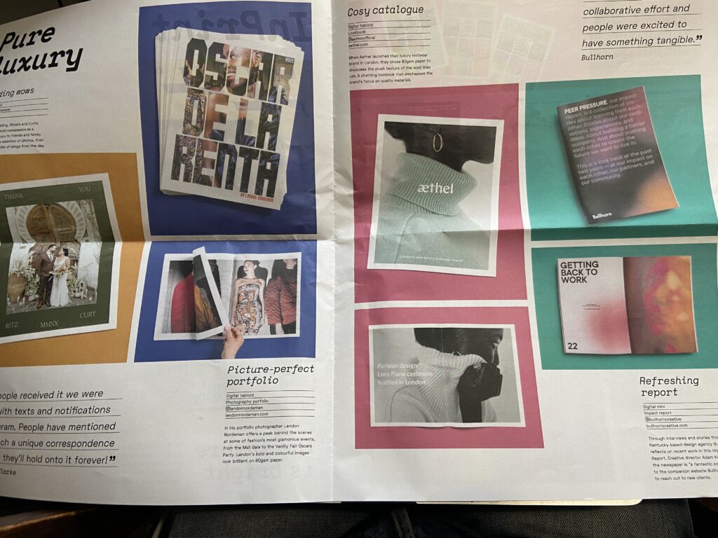
In my own work am fascinated by idea of folded works. I took images of a couple of different examples of such ways of displaying work I found at an exhibition for the Scottish Landscape Awards held at the City Art Centre in Edinburgh.
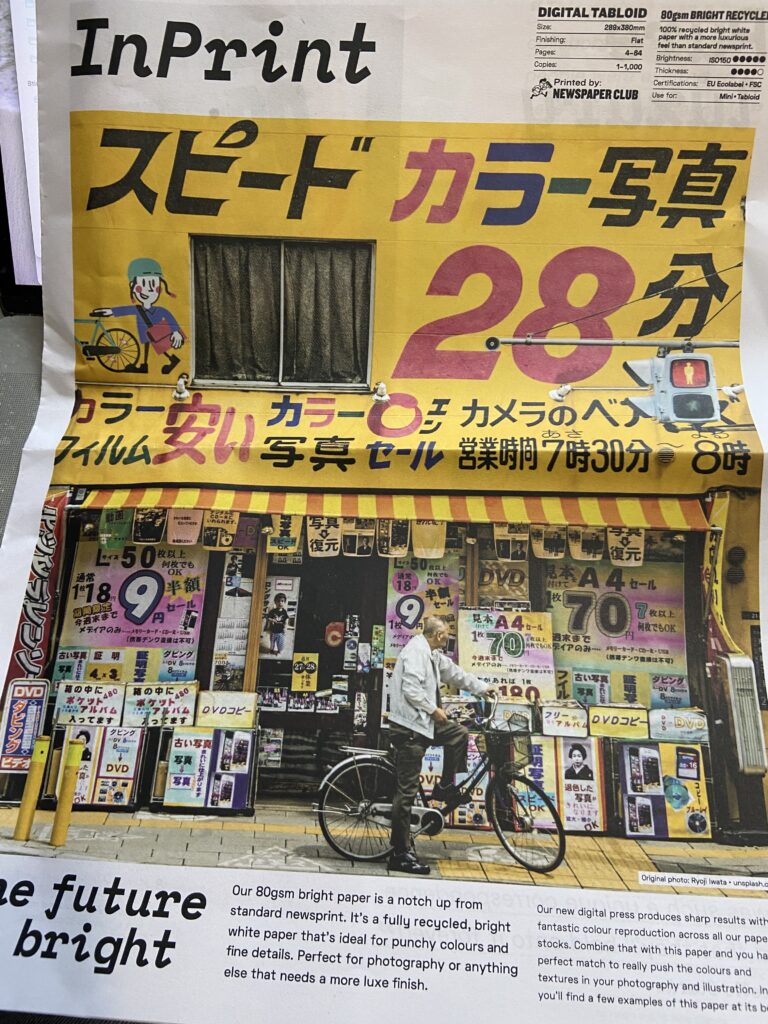
Although my initial interest was in how these works looked and were presented, when I was on my artist’s residency I took time to do some reseach and was reading “Slow Looking: The Art and Practice of Learning Through Observation” by Shari Tishman. This work made me reassess the assumptions I had made about the presentatyion of works folded and bound in different ways. I thought of another reason for this binding other than looking nice. These slow down the interaction with the audience, stopping the photograph being seen so quickly before moving on to look at the next piece.
Articulate your progress clearly and concisely regarding your networking and promotion plans and activities. Reflect on any challenges and action areas.
Record your findings in your learning log.
The artist’s residency I just completed was important step in building my network and in promoting myself and my work to a new audience. It was however just one step in many potential choices.
From the document in the OCA Enterprise Hub:
Promoting Yourself
Writing CVs, biographies, practitioner statements and developing a manifesto.
These written promotional tools are something I feel comfortable with., I have previously played with an artist’s statement and used different versions of this when I was applying for my artist’s residency. That feels like a key point in these documents. The knowledge of where and when to use these in my promotional journey. For example, a full CV might be useful in job application whereas practitioner statements, manifesto and artist’s statement are more useful when brevity is key and a longer CV would be too much. At this stage, I am focussed on an exhibition but maybe there is more scope to promote myself in different ways when submitting works to competitions, open calls or for display in a short summary of my work rather than a full exhibition of my current major project.
Online Enterprise Tools
Tools such as my OCA blog, my personal website, any sales platform I might use in the future and tools such as social media are things to consider at different points as I might need them. At present for example, I not considered the sale of my work so this might be something to look at in the future. I have rejoined Instagram and post some images there and do some networking. This the only social media platform I use in relation to my art. Platforms such as Twitter and Facebook are more of a political space for me. I also have a LinkedIn account but this was not tailored for my art and was a space I used for networking and job searches when I worked in the IT industry.
The course notes mention a business plan along with finances, selling and marketing. I don’t yet feel that this is necessarily something I would be interested in. Not at this stage.
Showcasing your Work
The showcasing my work section in the Enterprise Hub feels much more relevant to my personal journey at this stage than does the promotional elements mentioned above.
The start of this article on the motivations for displaying work seem highly relevant. “Understanding, in quite an intimate and challenging way sometimes, what you desire from exhibiting will inform your choice of context, your curatorial choices and your strategies for engagement. Being self aware and honest about why you are doing what you are doing will help you devise a realistic and rewarding plan. Look to your work and ask yourself what it needs. Look at the potential spaces available to you and ask yourself what those spaces might suggest or require of the work.”
It feels to me that refining and being comfortable with my project is a crucial step I must complete before I start to approach potential spaces for the display of my project. The self-awareness, my choices, the pieces I reject or add to my work and the order I place pieces within my sequence are all part of the curation of my own work. How can I then seek an external party when I am not yet clear in my head as to what my final project will look like? An online exhibition might be a good way to help me self-curate my work and imagine it in different gallery settings. I think that even at this early stage, my work has more meaning and complexity than can be shown online in the digital space so while a digital gallery setting is useful, I see this simply as a tool to how my work would look in real life.
The list of physical spaces in the Enterprise Hub document is extensive and includes National and regional galleries and museums, commercial galleries, white cube galleries, art fairs, community galleries, art walks, open studios, festivals, trade events, markets, craft events, informal settings, workshops, studios, pop-up spaces, street art, performance spaces and screening venues. The choice is almost overwhelming. To this list I also need to consider collaborative shows or solo efforts.
There are two interesting interviews on “Best Ways to Approach a Gallery” from curator Jamnea Finlayson and” How to get Notice by Galleries” by Erica Berkowitz. Unsurprisingly, these are skills the artist can work on and experiences to build upon. I think I might start to build myself a list and detail some of my early approaches as and when I feel my project is ready. As a prompt, this document asks the following questions. This seems as good a starting place as any.
What type of venue is it? – is it formal/informal, small/large, public/private, commercial/non-commercial/, subsidised/ independent.
What does it offer? – what is its location, context, size, lighting, access, remit, mission statement, reputation, local audience, surrounding network of practitioners,
What kind of work does the venue normally show? Look at archive of a gallery to get an idea of the kind of work they are interested in prompting.
Is the space artist or curator led? Who is in charge of the space, and how are decisions made? Who do you need to talk to?
Will the venue help support your aims? Does the venue give you what you need to help move your practice forward? Is it a suitable space for your work?
Is it a realistic option? It’s good to be ambitious, but equally to be practical. How achievable is your choice, given the timescales or remit of the venue.